Heya!
I've just read the 3 chapter you have up and here are my thoughts!:
- - I couldn't really pay attention during the first 2 chapters, I can't really remember much from them and I've just finish reading them!
Perhaps it's due to the details that clutter the scene?
- - In this platform the 'trends'are :
- Reincarnation/Rebirth/Second Chances
- Transmigration
- Smut
- Game-y elements
So anything outside of those tend to have a bit of a struggle.
- During the first chapter you mentioned that children that don't take part in the test-thing are seen as criminals, when I read that I was confused but curious to see if you were going to explain that bit. It was really the only reason I continued besides writing this! And I wasn't disappointed!
\(^ V^)/ Although I don't exactly believe that you should treat your audience as though they are a Dory, and make every scene bursting with drama and what-not, it's a good idea to think "Would I read this" while writing. You've also explained the world with-out saying it directly! I have a few ideas of why they would think those who do not participate are criminals and it thanks you showing snip bits of their opinions!
(Also, if I'm being honest I didn't even read the summary...I should get rid of that habit) But you've captured me, I'll be try to keep up with the story because I'm a sucker for survival story!
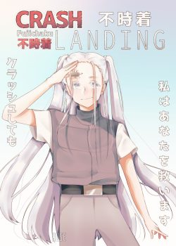
- Although I admire your efforts into making a cover (And not pasting an image you found off the internet, that's freak'in awesome!ლ(・ω・*ლ))
it's...kinda boring. There's not really a setting in the cover that helps me get..in to it? There's no atmosphere with in it that corresponds with the story basically. The character expression is not exactly expressive and their pose is stiff. The way you place the text is nice though! And once again I don't expect you to be a master at digital-art, you're writing after all.
I suggest creating a contrast between the character and the background, I am glad you didn't place the character in a blank space. Thumbs up! Spice it up with some dynamic lighting! Also, because the colour scheme is light, the word's red, bold 'CRASH' pop out more due to the pastel-y colours. Keep that it mind.
Remember! Your image is small when it's in passing! You don't want to go to dark or you can't see anything!!!
I don't expect you to make an amazing cover, you're writing after all, but a the
"Cover" and the
"Title" is what people see first.
(Sorry that this is more lengthy compare to the other points, I have more experience involving Number.4's points compared to the rest)
5. From what I've read, your writing ain't bad. It just the audience here don't really gun for it. Don't get discourage though! Who knows? Perhaps you'll change the trend here?
Personally, if you don't properly space your text, I drop it.
If you use to many descriptive terms, my head spins.
If your character's dialogue get's to long, I begin to daydream.
Some problems I had that I haven't mention was, I did get lost during the first two chapters because some of the text made it seem as though the P.O.V changed. The way you described the clothing left me confused but that's not a major issue.
I apologize if this wasn't helpful!ヾ(;゚Д゚;)シ Really, most of this was just me ranting about the cover...
Anyhow, I'll bee keeping an eye on this series! I'ma nickname it
"BOOM! CRASH" in my head! ╰(*´︶`*)╯
I'm tired now, so I'ma gonna Crash!(*´∇`*)
 www.scribblehub.com
 Of course. It isn't your writing. It is rarely here on scribblehub. I think it is your choice of topics.