D
Deleted member 45782
Guest
Story for a comedic effect. Just an idea for now...


Thanks haha. Yeah.Definitely the green one, at least it's more dynamic in a number of ways.
What exactly is the subject of the story?
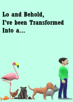
The blue one. First, I find that the title is better. Instead of merely saying "Yo I transformed again" it lets the reader ask themselves, "Wait, what did he transform into?" with the way its phrased, bringing their sense of curiosity to click the story. Second, I like that the graphic kinda looks like the "evolution of humans" thing. Overall, it just seems neater, and yet more eye catching.
What exactly is the subject of the story?
Thanks. "Low and Behold, I have transformed Into a..." was my original title but I changed it because I thought it'd be too long. But then again I have seen a lot of long titles on SH and NU... the shortened version of the title doesn't really emphasis the comedic effect of the story too..The blue one. First, I find that the title is better. Instead of merely saying "Yo I transformed again" it lets the reader ask themselves, "Wait, what did he transform into?" with the way its phrased, bringing their sense of curiosity to click the story. Second, I like that the graphic kinda looks like the "evolution of humans" thing. Overall, it just seems neater, and yet more eye catching.
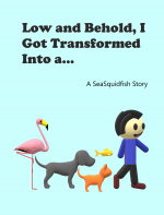
Lowkey still like the original better o_o maybe it's the guy and the color? lol the blue guy looks so happyy + the color is so on point :D plus the relative simplicity of the original cover makes the cover look cuter than having more animals in the new one.. and I think I like the center alignment more for the titleMade an Update. How does it look now?
I like how darthvader is extra blackThe blue one looks more organized. It has this kinda vibe:
