BenJepheneT
Light Up Gold - Parquet Courts
- Joined
- Jul 14, 2019
- Messages
- 5,344
- Points
- 233
To those that have frequented the forums for more than a year, my infatuation with the Need for Speed franchise isn't exactly a secret or a discovery. I've made 3 forum threads on it and each of them was more retarded than the last, but can you blame me; it's been my unofficial third surrogate parent since I was three, and I've finished just about every mainline entry through three console generations, with a few of them I've finished more than a half dozen times already.
Cutting to the chase, the reveal trailer for the new one dropped, and for the first time since, well, ever, I'm not excited about it; nor am I disappointed by it:
Once the trailer ended, my feelings could be summarized as stoked ambivalence.
Somehow, it was everything I feared it to be and hoped it would become.
I'll try to summarize my thoughts as concise as I can, but seeing as I'm bringing emotional baggage dating almost two decades old at this point, it's bound to be a bit lengthy.
Let's start off with the most obvious: the art style.
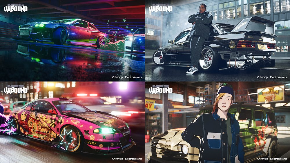
It's obvious that Criterion is inspired by the Spiderverse movie. Cel-shaded characters IS NOT a bad move by them, nor is it a terrible design. What I have problems with is the implementation. What Criterion is trying to go for here is a blend between hyperrealism and cel-shaded, stylized cartoon models. (No, it's not anime styled. Just because there are a few kanji and some Asians here and there doesn't make it Japanese.)
On paper, it doesn't sound like a bad idea. You can see movies like Roger Rabbit having it work. If I were to put on my tinfoil hat, I think Criterion here is trying to use the cell-shaded art style of the characters as an excuse to play with more exotic or outlandish designs on both the cars and the map, where they aren't hindered by rational limitations established by previous entries.
My problem comes with the contrast. I'm no art major, but I have eyes, and those eyes tell me that Criterion didn't really develop the concept as thorough as it could be.
I'll be as frank as a furter; these visuals do not match at all.
It's not that both styles lack inherent chemistry; it's that Criterion had the idea and just dumped both realism and cel-shading into one package without adjusting one another to ensure none of them clashed on-screen. The hyperrealism is fine on its own; it wouldn't be as special without the cel-shaded characters and cartoon effects but it's digestible to the eyes. You have the neon-washed urban aesthetics along with the brash, post-modern decals and aftermarket kits.
Right now, with the new cel-shading and vanity pop art, it stands out, in the worst way possible.
For one, these cel-shaded characters do not look inspired at all. They look like developed Snapchat filters. They don't carry the intricate details of the realism they're trying to pair it with and, if you saw the trailer, the animation seemed weighty and, dare I say, amateurish. It doesn't even look mo-capped. It looks like someone threw a few models and some scripts to a no-name South Korean studio that took bitcoins as payment. In short, they looked exactly like regular human models but with alien skin. The style was unique, but it's as thin as a sweat bead.
This extends towards the cartoon effects too, with the solid smoke and the wings that expand when nitrous is engaged.
Something tells me Criterion took some cues from the Chinese version of Asphalt 9 for the latter. And by cues, I mean monetization opportunities. Yes, the coloured smoke and the wings you see in the trailer will be sold as Vanity Items, or Skins, as they're more commonly known.

My issue isn't with EA charging money with in-game customization; that's to be expected, unfortunately. The items do not affect gameplay beyond visual elements, and that's the line I hope they'd never cross. My issue comes from the fact that again, they don't feel tacked on, they ARE tacked on.
There's this thing called visual noise when it comes to designing a game. There's underdeveloped, like most of Battlefield 2042's interiors. Then there's stylized, like, again, Into the Spiderverse. Then there's visual clutter, or visual noise, like the screenshot I'm about to show you:
Don't get me wrong: I'm of the opinion that Modern Warefare (2019) is one of Call of Duty's best entries so far, but one issue it has is too much detail. There's a baked-in film grain to each surface, and VRAM is not giving priority to player models over map textures. What I mean by this is that the map is so detailed that it makes it difficult to actually spot enemies. This is a prevalent issue in Warzone too. You can't see a sniper amongst the trees or between building windows unless they have their scope glints pointed directly at your screen. It is to the point where, unless you're playing in Extreme settings, the visuals actually distort if you're not running a good enough setup and it makes it even harder to see your enemies. If you've suffered from the wrath of Roze skins before, you know what I'm talking about.
The same thing applies to Need for Speed as well. Hell, the same thing happened to its 2012 entry, Most Wanted (not to be confused with Most Wanted 2005, which shares nothing but their names only). The game itself still looks fantastic despite being a decade old, but pray that you don't start a race in the afternoon facing the sun, or J.J. Abrams will personally pull his pants down from space and spread his asscheeks so far and wide that you can't help but be blinded by his sheer anal lens flare.
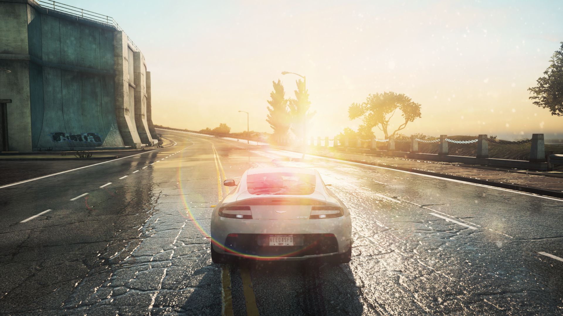
It doesn't look as bad in this screenshot, but when you're choosing between 3 small lanes and a highway and J.J.'s shine is blocking 60% of the screen with his glare, you're bound to hit a frustrating crash or two. You can't even see oncoming traffic until you're Frenching grilles, but might I digress?
Need for Speed Unbound's Vanity items is just a mess, plain and simple. The art style itself already doesn't fit, but they still intrude upon the gameplay with its bombastic presentation on already bombastic car models. Considering that such items will see prevalent use in multiplayer and that the game encourages players to "stand out", there's no doubt that it's gonna tank the visuals worse than it already was.
I miss the days of Black Ops 2 where customization went as far as pre-set camouflage that fitted the style of the game and the most outlandish item anyone could get was the diamond camo on the guns. Even then, the diamond camos rarely showed up, as they're MP end-game unlockables reserved for only the most dedicated of grinders, which means you rarely see them and whenever you do, you know you're in the presence of someone who hasn't seen grass in months. Now everyone wants to be unique so much that they don't even consider if they're being noticed for better or for worse, and companies, not just game devs, are marketing towards it without considering cohesion. But again, might I digress?
I don't even hate both styles individually. In fact, I think Need for Speed needed it. Simply riding on the most surface-level auto-tuning trend for a better half of a decade gets stale faster than one might think. The cel-shaded characters were the right direction to go, and pairing it with their established hyperrealism style is a boardroom eureka moment. Alas, Criterion wanted to have both cakes and eat them indiscriminately. They couldn't even be bothered to try and synthesize it. Now they've overstuffed themselves with two different types of confectionery that just needed some work to be good together, but now they just taste like chocolate and fish on the same dish.
It's fucked up because had they chosen one visual route to stick to, they would've had a great presentation in their hands. What's worse than that is that it's already been done.
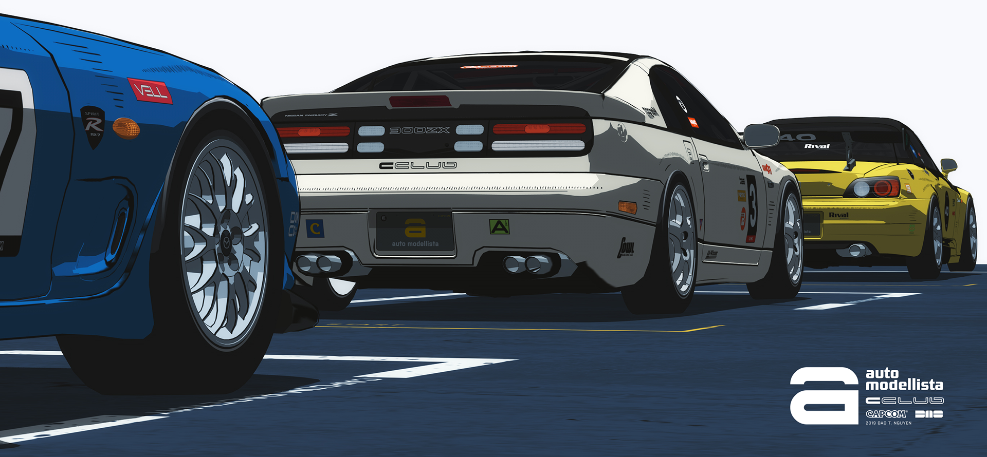
Introducing Auto Modellista.
A niche Capcom title only known among the inner circles of the simcade genre, this quaint Japanese title had Unbound beat in its commitment to its visuals. There's no attached hyperrealism to sell the reserved mainstream crowd nor is there any bombastic presentation to bolster its confidence. It doesn't try to package its cel-shaded art in some mish-mash of urban influence more varied than it is focused; it wanted to do one thing, and it excelled at it.
It doesn't make the fact any easier to swallow considering this game is released back in 2002 for the PS2 and the fucking Gamecube.
God, what a gem of a game. Too bad the gameplay is ass, but the aesthetics carry it for me so fuck if I care.
You might think I'm harping on the visuals more so than the actual gameplay of the video game itself, but speaking from experience of playing almost every entry since before most of you were born; I don't think Unbound would be any different from past entries in its gameplay department.
Say, for example, the car list (you can find them in a comprehensive list here: https://www.ea.com/en-gb/games/need-for-speed/need-for-speed-unbound/about/car-list). 143 cars might seem like a lot; even excessive, for some of you unfamiliar with the racing genre. Let me put it to you this way. Two of Need for Speed's biggest competitors, namely Forza Horizon 5 and The Crew 2, have 500 and 400 vehicles each respectively, with the latter including bikes, boats, and aeroplanes. Granted, they aren't as deeply customizable as Need for Speed's offerings, which has always been their selling point, but aside from pure numbers, the variety isn't great either.
If you look closely, most of Unbound's offerings contain variants. What variants are is that they're basically one car but a convertible, modified for competitions, a one-off special for an anniversary, and so on. One Porsche 911 model alone in said list has 9 variants to choose from. Nine. They're basically giving us one dude with 9 hairstyles and slightly varying body shapes and telling us they're all individuals.
Not to mention that 80% of these cars have appeared in past entries. They even have omitted manufacturers. Audi, which has always been a staple in the franchise, is nowhere to be seen, and Toyota is still absent since 2017. These are usually licensing issues that, even if the developers wanted to include them, have to contest with geriatric executives from manufacturers to even get their models in the game, much less with extensive modifications to their image. The fact still stands though; Unbound is a racing game whose car list is already considered anemic in the market and is still padded with the same model multiple times.
The map, too, is as uninspiring as it gets. For comparison's sake, I'm pairing it to the map from their last entry, Heat, and I'm not telling you which is which.

Granted, I'm using the leaked compilation for Unbound, but my point still stands.
If you still can't tell, the one I posted earlier was Unbound, and vice versa. The layout is virtually a carbon copy, with one city centre occupying one-third of the playing field and the rest being held off by small towns with canyons and banks in between.
It's not that the layout isn't good; the map is well-designed for the game's potential handling model, but I've played on this map before. This isn't Call of Duty where you can reapply the three-lane map for each map and have it play different: an open-world racing map needs more than a fresh coat of paint and a new art style to innovate from its predecessor. There isn't any standout part on the map that Heat didn't introduce and quite frankly, Heat stole a lot from Need for Speed's previous titles and from other franchises too to construct itself. Copying from your peers isn't a crime, but it's not enough by itself.
I should probably close this off, for now, seeing as I've written enough for a clickbait Kotaku article for 1 (one) reveal trailer.
Even if none of you read to the end, I still needed to write this, just so I could find closure after what I felt watching the premier. I've always been a close supporter for the games; that hasn't changed until now. It's only this time that, instead of the game itself providing me enthusiasm, I had to rely on my past loyalty to stick with this one.
I'm not one to pre-order games. I'm not even one to buy them. Hell, 90% of my games library, I've """"bought"""" for criminally less than I should've. Need for Speed, however, is the one franchise I find myself shilling a few shekels over during sales just to legally own it, and to see myself having such mixed feelings for it was a pretty jarring experience.
Perhaps I'm wrong. I hope I am. I hope I get proven wrong like a bumfuck idiot and the game becomes the landmark title that revived the series to its previous status as the arcade racing king. I hope this post ages like cold milk under the desert sun. We've always gotten decent Need for Speed games as of late, but it's been a long, long while since we got one that I could consider good; great, even.
I'm not hopeful for this one, but neither am I rooting for its demise.
As I said, stoked ambivalence.
Here's hoping.
Cutting to the chase, the reveal trailer for the new one dropped, and for the first time since, well, ever, I'm not excited about it; nor am I disappointed by it:
Once the trailer ended, my feelings could be summarized as stoked ambivalence.
Somehow, it was everything I feared it to be and hoped it would become.
I'll try to summarize my thoughts as concise as I can, but seeing as I'm bringing emotional baggage dating almost two decades old at this point, it's bound to be a bit lengthy.
Let's start off with the most obvious: the art style.
It's obvious that Criterion is inspired by the Spiderverse movie. Cel-shaded characters IS NOT a bad move by them, nor is it a terrible design. What I have problems with is the implementation. What Criterion is trying to go for here is a blend between hyperrealism and cel-shaded, stylized cartoon models. (No, it's not anime styled. Just because there are a few kanji and some Asians here and there doesn't make it Japanese.)
On paper, it doesn't sound like a bad idea. You can see movies like Roger Rabbit having it work. If I were to put on my tinfoil hat, I think Criterion here is trying to use the cell-shaded art style of the characters as an excuse to play with more exotic or outlandish designs on both the cars and the map, where they aren't hindered by rational limitations established by previous entries.
My problem comes with the contrast. I'm no art major, but I have eyes, and those eyes tell me that Criterion didn't really develop the concept as thorough as it could be.
I'll be as frank as a furter; these visuals do not match at all.
It's not that both styles lack inherent chemistry; it's that Criterion had the idea and just dumped both realism and cel-shading into one package without adjusting one another to ensure none of them clashed on-screen. The hyperrealism is fine on its own; it wouldn't be as special without the cel-shaded characters and cartoon effects but it's digestible to the eyes. You have the neon-washed urban aesthetics along with the brash, post-modern decals and aftermarket kits.
Right now, with the new cel-shading and vanity pop art, it stands out, in the worst way possible.
For one, these cel-shaded characters do not look inspired at all. They look like developed Snapchat filters. They don't carry the intricate details of the realism they're trying to pair it with and, if you saw the trailer, the animation seemed weighty and, dare I say, amateurish. It doesn't even look mo-capped. It looks like someone threw a few models and some scripts to a no-name South Korean studio that took bitcoins as payment. In short, they looked exactly like regular human models but with alien skin. The style was unique, but it's as thin as a sweat bead.
This extends towards the cartoon effects too, with the solid smoke and the wings that expand when nitrous is engaged.
Something tells me Criterion took some cues from the Chinese version of Asphalt 9 for the latter. And by cues, I mean monetization opportunities. Yes, the coloured smoke and the wings you see in the trailer will be sold as Vanity Items, or Skins, as they're more commonly known.
My issue isn't with EA charging money with in-game customization; that's to be expected, unfortunately. The items do not affect gameplay beyond visual elements, and that's the line I hope they'd never cross. My issue comes from the fact that again, they don't feel tacked on, they ARE tacked on.
There's this thing called visual noise when it comes to designing a game. There's underdeveloped, like most of Battlefield 2042's interiors. Then there's stylized, like, again, Into the Spiderverse. Then there's visual clutter, or visual noise, like the screenshot I'm about to show you:
Don't get me wrong: I'm of the opinion that Modern Warefare (2019) is one of Call of Duty's best entries so far, but one issue it has is too much detail. There's a baked-in film grain to each surface, and VRAM is not giving priority to player models over map textures. What I mean by this is that the map is so detailed that it makes it difficult to actually spot enemies. This is a prevalent issue in Warzone too. You can't see a sniper amongst the trees or between building windows unless they have their scope glints pointed directly at your screen. It is to the point where, unless you're playing in Extreme settings, the visuals actually distort if you're not running a good enough setup and it makes it even harder to see your enemies. If you've suffered from the wrath of Roze skins before, you know what I'm talking about.
The same thing applies to Need for Speed as well. Hell, the same thing happened to its 2012 entry, Most Wanted (not to be confused with Most Wanted 2005, which shares nothing but their names only). The game itself still looks fantastic despite being a decade old, but pray that you don't start a race in the afternoon facing the sun, or J.J. Abrams will personally pull his pants down from space and spread his asscheeks so far and wide that you can't help but be blinded by his sheer anal lens flare.
It doesn't look as bad in this screenshot, but when you're choosing between 3 small lanes and a highway and J.J.'s shine is blocking 60% of the screen with his glare, you're bound to hit a frustrating crash or two. You can't even see oncoming traffic until you're Frenching grilles, but might I digress?
Need for Speed Unbound's Vanity items is just a mess, plain and simple. The art style itself already doesn't fit, but they still intrude upon the gameplay with its bombastic presentation on already bombastic car models. Considering that such items will see prevalent use in multiplayer and that the game encourages players to "stand out", there's no doubt that it's gonna tank the visuals worse than it already was.
I miss the days of Black Ops 2 where customization went as far as pre-set camouflage that fitted the style of the game and the most outlandish item anyone could get was the diamond camo on the guns. Even then, the diamond camos rarely showed up, as they're MP end-game unlockables reserved for only the most dedicated of grinders, which means you rarely see them and whenever you do, you know you're in the presence of someone who hasn't seen grass in months. Now everyone wants to be unique so much that they don't even consider if they're being noticed for better or for worse, and companies, not just game devs, are marketing towards it without considering cohesion. But again, might I digress?
I don't even hate both styles individually. In fact, I think Need for Speed needed it. Simply riding on the most surface-level auto-tuning trend for a better half of a decade gets stale faster than one might think. The cel-shaded characters were the right direction to go, and pairing it with their established hyperrealism style is a boardroom eureka moment. Alas, Criterion wanted to have both cakes and eat them indiscriminately. They couldn't even be bothered to try and synthesize it. Now they've overstuffed themselves with two different types of confectionery that just needed some work to be good together, but now they just taste like chocolate and fish on the same dish.
It's fucked up because had they chosen one visual route to stick to, they would've had a great presentation in their hands. What's worse than that is that it's already been done.
Introducing Auto Modellista.
A niche Capcom title only known among the inner circles of the simcade genre, this quaint Japanese title had Unbound beat in its commitment to its visuals. There's no attached hyperrealism to sell the reserved mainstream crowd nor is there any bombastic presentation to bolster its confidence. It doesn't try to package its cel-shaded art in some mish-mash of urban influence more varied than it is focused; it wanted to do one thing, and it excelled at it.
It doesn't make the fact any easier to swallow considering this game is released back in 2002 for the PS2 and the fucking Gamecube.
God, what a gem of a game. Too bad the gameplay is ass, but the aesthetics carry it for me so fuck if I care.
You might think I'm harping on the visuals more so than the actual gameplay of the video game itself, but speaking from experience of playing almost every entry since before most of you were born; I don't think Unbound would be any different from past entries in its gameplay department.
Say, for example, the car list (you can find them in a comprehensive list here: https://www.ea.com/en-gb/games/need-for-speed/need-for-speed-unbound/about/car-list). 143 cars might seem like a lot; even excessive, for some of you unfamiliar with the racing genre. Let me put it to you this way. Two of Need for Speed's biggest competitors, namely Forza Horizon 5 and The Crew 2, have 500 and 400 vehicles each respectively, with the latter including bikes, boats, and aeroplanes. Granted, they aren't as deeply customizable as Need for Speed's offerings, which has always been their selling point, but aside from pure numbers, the variety isn't great either.
If you look closely, most of Unbound's offerings contain variants. What variants are is that they're basically one car but a convertible, modified for competitions, a one-off special for an anniversary, and so on. One Porsche 911 model alone in said list has 9 variants to choose from. Nine. They're basically giving us one dude with 9 hairstyles and slightly varying body shapes and telling us they're all individuals.
Not to mention that 80% of these cars have appeared in past entries. They even have omitted manufacturers. Audi, which has always been a staple in the franchise, is nowhere to be seen, and Toyota is still absent since 2017. These are usually licensing issues that, even if the developers wanted to include them, have to contest with geriatric executives from manufacturers to even get their models in the game, much less with extensive modifications to their image. The fact still stands though; Unbound is a racing game whose car list is already considered anemic in the market and is still padded with the same model multiple times.
The map, too, is as uninspiring as it gets. For comparison's sake, I'm pairing it to the map from their last entry, Heat, and I'm not telling you which is which.
Granted, I'm using the leaked compilation for Unbound, but my point still stands.
If you still can't tell, the one I posted earlier was Unbound, and vice versa. The layout is virtually a carbon copy, with one city centre occupying one-third of the playing field and the rest being held off by small towns with canyons and banks in between.
It's not that the layout isn't good; the map is well-designed for the game's potential handling model, but I've played on this map before. This isn't Call of Duty where you can reapply the three-lane map for each map and have it play different: an open-world racing map needs more than a fresh coat of paint and a new art style to innovate from its predecessor. There isn't any standout part on the map that Heat didn't introduce and quite frankly, Heat stole a lot from Need for Speed's previous titles and from other franchises too to construct itself. Copying from your peers isn't a crime, but it's not enough by itself.
I should probably close this off, for now, seeing as I've written enough for a clickbait Kotaku article for 1 (one) reveal trailer.
Even if none of you read to the end, I still needed to write this, just so I could find closure after what I felt watching the premier. I've always been a close supporter for the games; that hasn't changed until now. It's only this time that, instead of the game itself providing me enthusiasm, I had to rely on my past loyalty to stick with this one.
I'm not one to pre-order games. I'm not even one to buy them. Hell, 90% of my games library, I've """"bought"""" for criminally less than I should've. Need for Speed, however, is the one franchise I find myself shilling a few shekels over during sales just to legally own it, and to see myself having such mixed feelings for it was a pretty jarring experience.
Perhaps I'm wrong. I hope I am. I hope I get proven wrong like a bumfuck idiot and the game becomes the landmark title that revived the series to its previous status as the arcade racing king. I hope this post ages like cold milk under the desert sun. We've always gotten decent Need for Speed games as of late, but it's been a long, long while since we got one that I could consider good; great, even.
I'm not hopeful for this one, but neither am I rooting for its demise.
As I said, stoked ambivalence.
Here's hoping.
Last edited: