ars
trash bin
- Joined
- Jan 29, 2019
- Messages
- 105
- Points
- 83
After reviewing some of my juniors at work, I wanted to share some quick advice in case it helps anyone else. This is best suited for beginners who are just starting to use color, and for intermediate artists who want to brush up on their understanding.
This lesson will be about the importance of choosing the right shadow colors for your art, and how different shadows will create a different impression of the same colors and drawing.
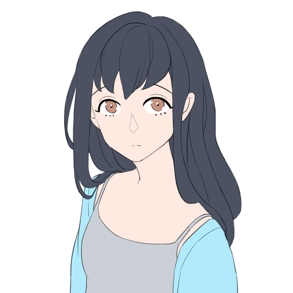
This is the base drawing we'll be working with. I chose basic, neutral, cool colors.
When you first start coloring, it's difficult to know what colors will look good together. As such, it's tempting to do shadows by selecting a darker version of the same color, like so:

In this drawing, all of the shadows are drawn in black at a low opacity. While this is quick and effective, the colors look dull and dead. She doesn't look interesting to look at.
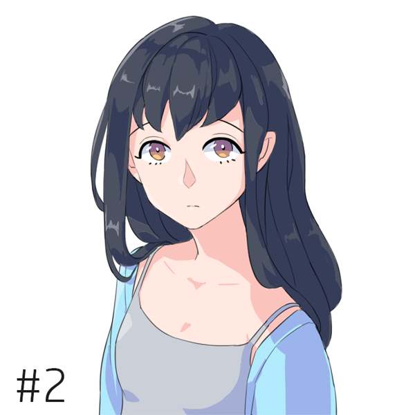
This is what happens if we customize the shadow color of each object. The shadow of the hair is now a more blue color; the skin shadow is now more pink/red; the jacket and tank top shadows are now more blue/purple. The base colors of the drawing remain unchanged. Just like that, the energy of the drawing changes. It looks brighter and more lively.
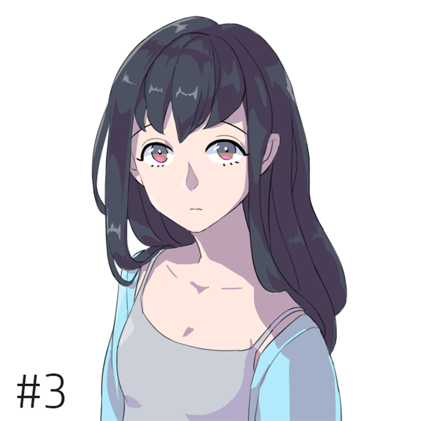
Even if you want to draw something grittier and darker, it's important to choose a palette. This drawing looks more serious, and a little unsettling - like something you might see in a dark anime. Even though everything feels grayer because the colors are less saturated, it's still a more interesting palette. Each shadow has a purple/red shade to it, and none of them are pure grey or black.
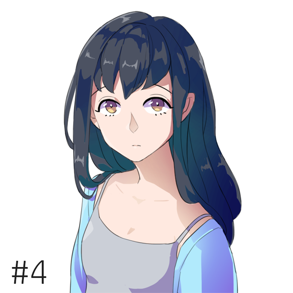
Here is another alternate palette. In this version, all of the shadows are more saturated, with stronger and more vibrant colors. To balance the shadow darkness and keep them from overwhelming the base colors, I also airbrushed the base colors over the shadows, which softens the shadow edges where they meet the light. Vibrant colors + airbrushing such as this are commonly used in pop visual novel art.
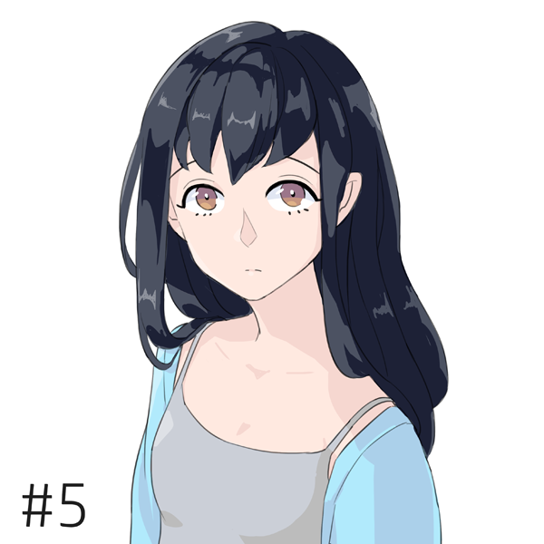
This is an example of some mistakes beginning artists make when coloring their art. The logical thought process goes like this: her hair is black, so the shadow color of her hair should be black. Her skin is light and pale, so the shadow of her skin should also be light and pale, not too different from the base color. Her clothes are light-colored and don't stand out, so they shouldn't be too different from the base color.
Unfortunately, thinking like this doesn't work. A shadow is more than just making something darker. The shadow is like adding another flavor to your art - it is a chance to show a different side of the color, and to create interesting effects via color combinations. The choices in this art are extremely "safe" and boring, and don't add any personality to the art.
Furthermore, the hair shadow is too dark while the skin/clothes shadows are too light, causing the entire drawing to feel imbalanced. The shadow of the hair overwhelms her head, while the rest of the shadows are barely noticeable. This creates a jarring contrast and makes everything feel unfinished. This could be fixed by making the hair shadow a little lighter and the rest of the shadows a little darker.
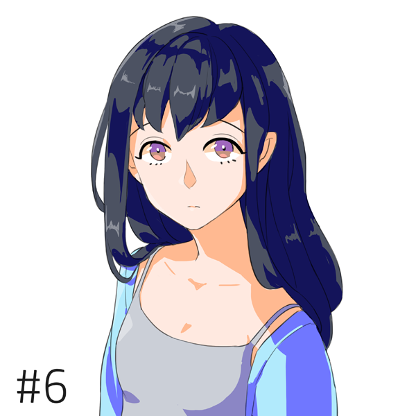
Another mistake beginner artists sometimes make is oversaturation of their colors, or not knowing how to balance the strength of their colors. While in some cases, experienced artists can use highly saturated/strong colors to make vibrant pop art (such as this art by Akiakane), a new artist chooses an oversaturated color because they want to make sure the color is obvious, and they are afraid that picking a color that is too 'grey' or not bright enough will make the art look dull. It's difficult to find the balance, but the more you experiment with colors, the easier it will be to find the ones you were looking for.
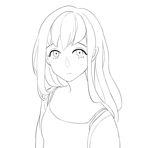
Finally, if you would like to try coloring with this drawing yourself, here is the lineart.
While this is just a very quick rundown, I hope it's helpful for someone out there! Good luck. If you have any specific questions or want some advice, I'll try to help.
This lesson will be about the importance of choosing the right shadow colors for your art, and how different shadows will create a different impression of the same colors and drawing.
This is the base drawing we'll be working with. I chose basic, neutral, cool colors.
When you first start coloring, it's difficult to know what colors will look good together. As such, it's tempting to do shadows by selecting a darker version of the same color, like so:
In this drawing, all of the shadows are drawn in black at a low opacity. While this is quick and effective, the colors look dull and dead. She doesn't look interesting to look at.
This is what happens if we customize the shadow color of each object. The shadow of the hair is now a more blue color; the skin shadow is now more pink/red; the jacket and tank top shadows are now more blue/purple. The base colors of the drawing remain unchanged. Just like that, the energy of the drawing changes. It looks brighter and more lively.
Even if you want to draw something grittier and darker, it's important to choose a palette. This drawing looks more serious, and a little unsettling - like something you might see in a dark anime. Even though everything feels grayer because the colors are less saturated, it's still a more interesting palette. Each shadow has a purple/red shade to it, and none of them are pure grey or black.
Here is another alternate palette. In this version, all of the shadows are more saturated, with stronger and more vibrant colors. To balance the shadow darkness and keep them from overwhelming the base colors, I also airbrushed the base colors over the shadows, which softens the shadow edges where they meet the light. Vibrant colors + airbrushing such as this are commonly used in pop visual novel art.
This is an example of some mistakes beginning artists make when coloring their art. The logical thought process goes like this: her hair is black, so the shadow color of her hair should be black. Her skin is light and pale, so the shadow of her skin should also be light and pale, not too different from the base color. Her clothes are light-colored and don't stand out, so they shouldn't be too different from the base color.
Unfortunately, thinking like this doesn't work. A shadow is more than just making something darker. The shadow is like adding another flavor to your art - it is a chance to show a different side of the color, and to create interesting effects via color combinations. The choices in this art are extremely "safe" and boring, and don't add any personality to the art.
Furthermore, the hair shadow is too dark while the skin/clothes shadows are too light, causing the entire drawing to feel imbalanced. The shadow of the hair overwhelms her head, while the rest of the shadows are barely noticeable. This creates a jarring contrast and makes everything feel unfinished. This could be fixed by making the hair shadow a little lighter and the rest of the shadows a little darker.
Another mistake beginner artists sometimes make is oversaturation of their colors, or not knowing how to balance the strength of their colors. While in some cases, experienced artists can use highly saturated/strong colors to make vibrant pop art (such as this art by Akiakane), a new artist chooses an oversaturated color because they want to make sure the color is obvious, and they are afraid that picking a color that is too 'grey' or not bright enough will make the art look dull. It's difficult to find the balance, but the more you experiment with colors, the easier it will be to find the ones you were looking for.
Finally, if you would like to try coloring with this drawing yourself, here is the lineart.
While this is just a very quick rundown, I hope it's helpful for someone out there!
