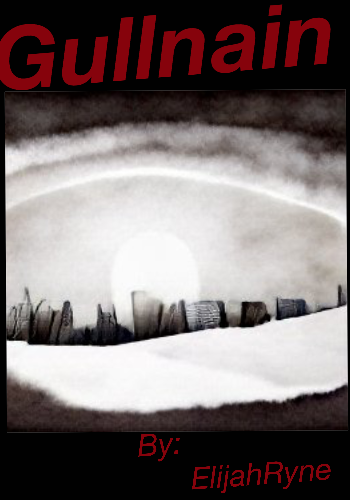
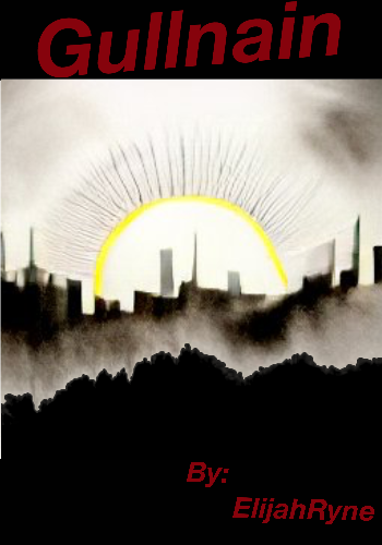
Two potential covers made with the help of A.I. Which is better?

Which is better?

  • 1

    Votes: 22 81.5%
  • 2

    Votes: 5 18.5%

  • Total voters
    27

ElijahRyne

A Hermit that is NOT that Lazy…
Joined
Aug 12, 2021
Messages
1,031
Points
153
If this will help, the series is a mystery/horror. While helping his friend who is hiding, Garry(name is a w.i.p.) is forced to face the supernatural side of his city, including the Winter Eye.

1
3EB7FE90-D3B9-4D37-9584-A441F5C5A66F.png

2
A8AFFED2-3BE6-42F4-BB73-8B2AC6831579.png
 

DarkeReises

Ultimate Wankmaster, Jizzer of Universes
Joined
Nov 27, 2020
Messages
956
Points
133
I personally think that the first is definitely better. I feel like the second would work on a slightly different kinda theme and setting. The typesetting could be better tho...

The best way I can describe my feelings towards the second cover is that it belongs as an asset(or still a cover) for an indie analog horror game, but I feel that it's way too hard to get the feel of such a game in pure written form so it just wouldn't fit for me. The dissonance between the cover and the writing(as I imagine the feeling it could give) are incongruous in my opinion.

The first one feels more straightforward horror novel and would fit better.

AI-generated art does have a really good style of horror, and I'm pretty sure the Happy Meat Farms ARG uses AI-generated imagery and it makes for really disturbing scenes in their videos, but again I just think having such an art style on the cover when the writing can't really express the same kind of disturbance the images puts me off.

Then again I'm just one guy speaking out of my ass trying to explain the weird emotions I feel when I compare the two images provided lmao. Other people probably feel completely different and have no idea what the fuck I'm on about. I've also never read your works, so I'm basing this on how I feel horror writing in general makes me feel. For all I know you could somehow manage to write in a way that fits the particular style of AI-generated horror imagery.

Anyways I have no idea what the fuck I just wrote, so take from it what you will lmfao
 
Last edited:

CCmei

Well-known member
Joined
Dec 25, 2019
Messages
22
Points
53
The first one definitely catches the eye better, no pun intended. While the other one seems to be more forgettable and easier to fade from one's memory. I recommend the first one as a cover for now, and if you want, to spend more time making or tweaking the second if you're very fond of it.
 

Viator

Wandering Moon that conceals the tide
Joined
Jan 8, 2019
Messages
198
Points
83
Definitely go with the first. Given the theme is a mystery/horror it is a better fit. The second one is too bleak, and gives off the impression of being too honest. It highlights the horror with none of the mystery. The skyline is dark and drab with only the slightest feeling of intensity due to the silhouette of an eye in the sky.

The first fits the theme much better because of the contrast. You have the same gray skyline that seems brightly lit by some kind of sun. The sun gives the impression of the illusion of normalcy and even hope. But the skyline is still dark. Something is not right under the illusion. There is a fog between the viewer and the city despite the light, symbolizing an ever present threat. That gives you more of a mystery vibe with a slight tinge of uneasiness in the horror of the unknown.

Again my primary problem with the second drawing is that it's an honest naked horror, which pales in comparison to unknown horror that creeps up on you unaware. The secret to scaring anyone lies in mystery. Once the unknown is made known in it's entirety, the horror is lost.
 

Tsuru

Well-known member
Joined
Feb 5, 2019
Messages
591
Points
133
Both are pretty cool, but the first one wins with that yellow ring with eyelashes.
I support his oppinion
DITTO

I also add : 2nd cover seems to hurt the eyes if looking at it because of slight blurred effect on it. But again, people won't find out as they wont zoom in to see the cover as big.
 

Snowyflakes

Active member
Joined
Jul 29, 2022
Messages
85
Points
33
From the description you've provided, I think the second cover is more of a match. However, the first one might work as well, and it captures attention immediately.
 

Twin

Well-known member
Joined
Nov 29, 2021
Messages
81
Points
58
I can't understand either of them. (❁´◡`❁)But the first one looks flashier cause of brighter colors.
 
Top