Which cover to use?

Which cover is best?


  • Total voters
    17

LinMeili

Well-known member
Joined
Jan 9, 2021
Messages
166
Points
83
Hi guys, I posted my first fic. I did my best with the covers but I suck at judging art. Can you please tell me which cover is the best one?
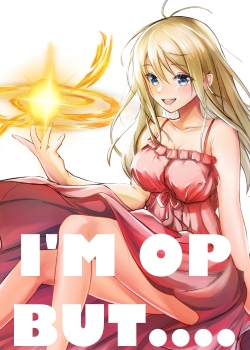
SCRIB-CVR.jpg

I am currently using this one. Commissioned art
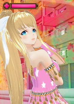
cover-hpbar.jpg

Cover made with free software VroidStudio.
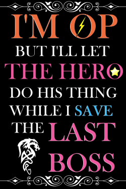
cvr-3.png

Typography cover made with free software Paint.net
 

LotsChrono

Well-known member
Joined
Nov 10, 2020
Messages
256
Points
103
Hi guys, I posted my first fic. I did my best with the covers but I suck at judging art. Can you please tell me which cover is the best one?

View attachment 6585
I am currently using this one. Commissioned art

View attachment 6586
Cover made with free software VroidStudio.

View attachment 6587
Typography cover made with free software Paint.net
First, I think you should edit your post and add a poll to make it easier to tally votes up.

Second, I choose the third. The typography cover.
 

BenJepheneT

Light Up Gold - Parquet Courts
Joined
Jul 14, 2019
Messages
5,344
Points
233
I'd say stick to the commissioned art, because the typography is literally just words and the free software just looks (sorry but for a lack of a better word) cheap.

The original cover already catches my attention with a BUT...

It's taunting me to read it, to know what's the BUT...
 

LinMeili

Well-known member
Joined
Jan 9, 2021
Messages
166
Points
83
First, I think you should edit your post and add a poll to make it easier to tally votes up.

Second, I choose the third. The typography cover.
Thanks. I added the poll. I hope it works!

I'd say stick to the commissioned art, because the typography is literally just words and the free software just looks (sorry but for a lack of a better word) cheap.

The original cover already catches my attention with a BUT...

It's taunting me to read it, to know what's the BUT...
Oh, but....

Thanks!
 

LotsChrono

Well-known member
Joined
Nov 10, 2020
Messages
256
Points
103
Covers don't really matter as much as a good title and synopsis. I mean, look at the current trending novels on the site. 4 of the top 9 don't even have covers, that's almost half, while two more just have stock images with no texts or edits. And they each have a hefty amout of views. Even what @BenJepheneT said pertains more to the title than the cover itself.

So, in the end, it hardly matters what you pick, as you can always pick what you yourself like best.

Though, I still say 3 is best.
 

LinMeili

Well-known member
Joined
Jan 9, 2021
Messages
166
Points
83
Covers don't really matter as much as a good title and synopsis. I mean, look at the current trending novels on the site. 4 of the top 9 don't even have covers. That's almost half. And they each have a hefty amout of views. Even what @BenJepheneT said pertains more to the title than the cover itself.

So, in the end, it hardly matters what you pick, as you can always pick what you yourself like best.

Though, I still say 3 is best.
I wonder if it would be alright to ask for feedback on my synopsis then? Maybe I'll start a new thread tomorrow.
 

LotsChrono

Well-known member
Joined
Nov 10, 2020
Messages
256
Points
103
I wonder if it would be alright to ask for feedback on my synopsis then? Maybe I'll start a new thread tomorrow.
Aye aye, now that is what I'd focus more energy on, if I had to pick between the two.

I do wish you luck~
 
D

Deleted member 29316

Guest
The first one is good, but missing its title.

The third one is also good, but if you're looking to attract readers, you'll definitely want a cute girl in your cover.
 

Ruriha

Well-known Procrastinator
Joined
Mar 25, 2020
Messages
220
Points
103
First one, just needs a better font and placement
 

Reisinling

Well-known member
Joined
Feb 5, 2021
Messages
357
Points
63
First one. Also, I suggest using inkscape instead of paint.net for covers, easier to make small changes later.
Add thin outline to the title font, black would make it visible but wouldn't look too nice... honestly, it might be a good idea to just ditch the text, anime girls are good enough for this site. And I'm saying this as a guy that spends far too much time making covers :D

Covers don't really matter as much as a good title and synopsis. I mean, look at the current trending novels on the site. 4 of the top 9 don't even have covers, that's almost half, while two more just have stock images with no texts or edits. And they each have a hefty amout of views. Even what @BenJepheneT said pertains more to the title than the cover itself.

So, in the end, it hardly matters what you pick, as you can always pick what you yourself like best.

Though, I still say 3 is best.
It depends on where your readers come from. I had people comment that they clicked on my novel from novelupdates, because the cover was interesting. I think that title and cover are super important together, then synopsis
 

Ai-chan

Queen of Yuri Devourer of Traps
Joined
Dec 23, 2018
Messages
1,413
Points
153
Just Ai-chan's impression, feel free to ignore it if it bothers you.

First one is more catchy, but you totally wasted the potential with the typography.

Second one is a no. It feels amateurish.

Third one is actually really good. If you got traditionally published, this is probably the type of cover you'd get, assuming the book is self-help. You just need to vary the font and font styles and it'd easily be the best.
 

LinMeili

Well-known member
Joined
Jan 9, 2021
Messages
166
Points
83
The first one is good, but missing its title.

The third one is also good, but if you're looking to attract readers, you'll definitely want a cute girl in your cover.
Thanks! I couldn't get the title to fit the cover since it's too long.
First one, just needs a better font and placement
I'm a little dumb when it comes to fonts. It all looks the same to me.
First one. Also, I suggest using inkscape instead of paint.net for covers, easier to make small changes later.
Add thin outline to the title font, black would make it visible but wouldn't look too nice... honestly, it might be a good idea to just ditch the text, anime girls are good enough for this site. And I'm saying this as a guy that spends far too much time making covers :D


It depends on where your readers come from. I had people comment that they clicked on my novel from novelupdates, because the cover was interesting. I think that title and cover are super important together, then synopsis
Thanks, I'll look into inkscape. Or I'll ditch the text. That seems easier.
First one no doubt
It seems most agree.
Just Ai-chan's impression, feel free to ignore it if it bothers you.

First one is more catchy, but you totally wasted the potential with the typography.

Second one is a no. It feels amateurish.

Third one is actually really good. If you got traditionally published, this is probably the type of cover you'd get, assuming the book is self-help. You just need to vary the font and font styles and it'd easily be the best.
Thanks, Ai-chan. I'll probably try to fix the first one since people like it the most.
 
D

Deleted member 45782

Guest
First one, among the three.

Second one looks like a scene and not a cover. Many covers I've seen look more like a scene of something, but not something cover-material like.

Third one is just too much text and too many varying kinds of typography. Keep cover simple.
 

LinMeili

Well-known member
Joined
Jan 9, 2021
Messages
166
Points
83
First one, among the three.

Second one looks like a scene and not a cover. Many covers I've seen look more like a scene of something, but not something cover-material like.

Third one is just too much text and too many varying kinds of typography. Keep cover simple.
Thank you. I've decided to go with the first one since that was the result of the poll.
 

CadmarLegend

@Agentt found a key in the skeletons.
Joined
Jan 3, 2021
Messages
1,957
Points
153
Hi guys, I posted my first fic. I did my best with the covers but I suck at judging art. Can you please tell me which cover is the best one?

View attachment 6585
I am currently using this one. Commissioned art

View attachment 6586
Cover made with free software VroidStudio.

View attachment 6587
Typography cover made with free software Paint.net
Probably a bit late, but the first cover... because it is the only one which has a decent "protagonist/person on it".

Let me explain.

I'll point out the flaws with the second and third cover first.

The second cover... the girl on it looks... unlike a person at all....Or it couls just be the weirdly mixed background at the back...

In the third cover, there are only words... no one's gonna read the words on a cover... just the pictures...

The first cover has a character with perfect background and life-like features when drawn. That is my own opinion, though...


Thank you. I've decided to go with the first one since that was the result of the poll.
I just realized that you posted this.... :s_eek::sweating_profusely:

All that hard work I did while typing... :blob_teary:
 
Top