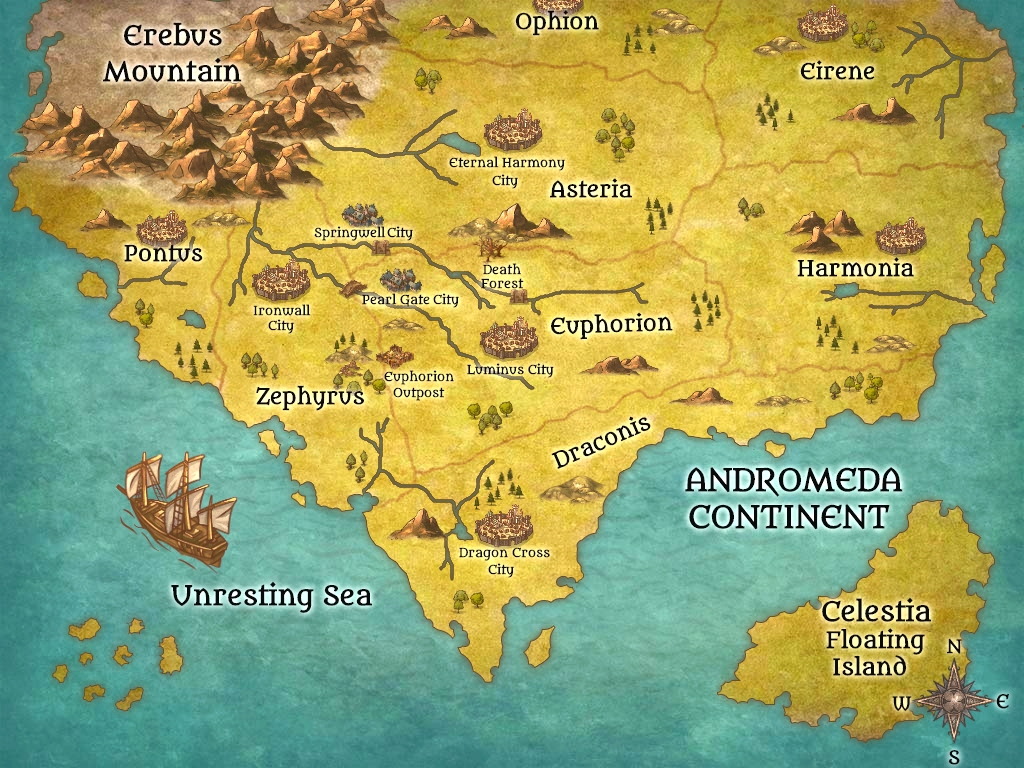
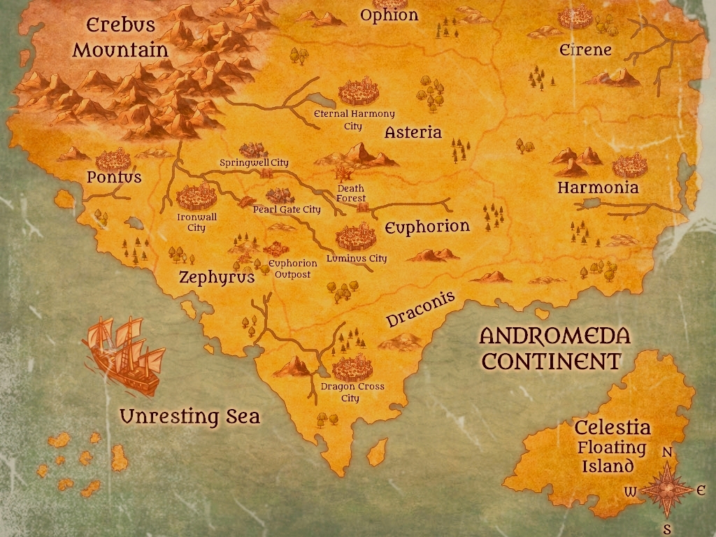
Which one is better?

Which one better?

  • 1

    Votes: 22 88.0%
  • 2

    Votes: 3 12.0%

  • Total voters
    25

Nanakawaichan

Well-known member
Joined
Jan 9, 2020
Messages
205
Points
83
I made a map for my story
Which one more suitable?
20-01-02-11-46-11-180_deco.jpg


Or

20-01-06-19-08-45-431_deco.jpg


Please give your opinion why you choose it.
 
Last edited:

Blitz

『⛰Ping-Pong Cat❄️』『⚡️New member⚡️』
Joined
Dec 23, 2018
Messages
248
Points
133
First one.I understand that the second ones going for an old and worn map look but the first one is so much more pleasing to the eyes in comparison. The second one might be better if the brown shading wasn't so intense I think.

Also add a poll so people can vote
 

BenJepheneT

Light Up Gold - Parquet Courts
Joined
Jul 14, 2019
Messages
5,344
Points
233
sorry but as an aesthetic man, I'm going for numero dos

there's definitely a heavy shade of rustic brown but I could still read the words so that's no problem
 

Nanakawaichan

Well-known member
Joined
Jan 9, 2020
Messages
205
Points
83
First one.I understand that the second ones going for an old and worn map look but the first one is so much more pleasing to the eyes in comparison. The second one might be better if the brown shading wasn't so intense I think.

Also add a poll so people can vote
Thank you for your advice.
 

Elim

Well-known member
Joined
Dec 3, 2019
Messages
21
Points
53
First one for sure. It's vivid and much easier to see than the second. Sure the second one makes it look more ancient and worn. But what matters is the visibility and clarity. Reinforcing the above answers ^^
 

Silvareiel

Member
Joined
May 14, 2019
Messages
25
Points
13
First one is more catchy and at the same time easier to read / follow. I for once love novels with maps and if there's a quest going on I do take the time to "track" the characters' quest, as where they go from here to there and so on. First one is somehow easier on the eyes.
If I may ask, did you draw them from scratch?
 

TheIcMan

Well-known member
Joined
May 4, 2019
Messages
31
Points
48
Okay okay, first of all, this is amazing, the first one in particular.

Next I’m curious, just like the guy above. I recognize the font to be from Campfire, but did you use photoshop or something similar to outline and decorate the actual map?
 

Nanakawaichan

Well-known member
Joined
Jan 9, 2020
Messages
205
Points
83
As everyone else has said, the first, both in terms of overall aesthetics and readability.

FWIW, if you wanna do a sort of "aged" map look, the second one doesn't work. It's essentially just an ultra bright brown bloom and doesn't look aged at all, it just looks like the first map with a brown-red overlay, or maybe a photo of a map that has aged. When paper ages, the opposite happens -- it becomes paler and loses pigmentation. Ink fades, especially in areas that get more exposure or handling (i.e. the edges of the paper, where hands/fingers are constantly rubbing it). The browning is caused by buildup of dirt and filth, as well as the ink discolouring due to exposure.

This is a quick and dirty job and I don't claim to be much of a graphic designer, but ageing for paper would look a little more like this:
Wow, thank you.
Actually it's doesn't have to be an old map since my story not take place in middle ages. I just want my map a little old since the first map looks too colourful for my story.
 

Yorda

Villainess Yorda the Virtuous Flower of Evil
Joined
Aug 9, 2019
Messages
468
Points
133
My personal favourite, number 1, the more colourful one.

Most people can only dream of having story maps that look this good!
 

RinDes

Well-known member
Joined
Oct 30, 2019
Messages
38
Points
58
To be perfectly honest, I believe both to be equally interesting. And it all comes down to the actual purpose for the map: both are different in style, and the contrast makes for an interesting combo. But if I personally had to choose, I'd go with the second one; its antique style more my cup of tea.
 
Top