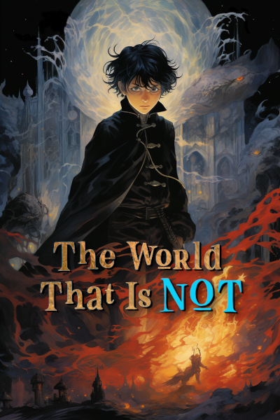
Cover Change, Whaddya Think?

nemonusquam_

Member
Joined
Sep 18, 2023
Messages
53
Points
18
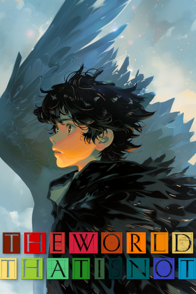
'Sup Scribble Hubbers. I changed my cover after tinkering the better part of yesterday with MidJourney and GIMP. Do you think this is an improvement? Let me know!

NEW COVER:
new_cover.png

OLD COVER:
new_cover.png
 

Nahrenne

Pure and Innocent Maiden~
Joined
Jan 2, 2019
Messages
1,081
Points
153
'Sup Scribble Hubbers. I changed my cover after tinkering the better part of yesterday with MidJourney and GIMP. Do you think this is an improvement? Let me know!

NEW COVER:
View attachment 25490
OLD COVER:
View attachment 25491
I prefer the older one, both because of how the text looks, as well as how it seems to give more hints of what to expect from the story than the new version does.
'-'

X
 

LilRora

Mostly formless
Joined
Mar 27, 2022
Messages
889
Points
133
I'd say the old one is better.

On the new one, the text it difficult to read, especially the letter S that almost blends into the image. What you have there also doesn't seem to match the image in any way, neither in colors nor in style. If you want to keep the colored frames, I recommend to either shade them to make the letters more distinct or create a single gradient background for all the letters, to create a separate element for the text instead of just putting them over the image.

The second thing, consider how you want the cover to feel; is it supposed to convey mystery, fear, melancholy, or yet something else. The newer is much brighter, so it feels lighter, but the pose of the character (especially how he's looking to the side) and the colors give a completely different, weaker impression than the intense colors, contrast, and direct stare of the character in the old cover. I'm not sure what effect you want to achieve, but based on your synopsis I'd say the new one doesn't fit. It feels melancholic, calm, uncertain, even almost sad.

The old one could also use some polishing and smaller changes, but overall it looks much better to me.
 
Last edited:

placeintime

Yeeting myself out
Joined
Apr 13, 2020
Messages
122
Points
83
Both look nice. But I would choose the old one. The new one has a clean and cut feel to it. But the title is kind of a mismatch. You have a rainbow text and then you have the figure having a serious expression.
 

nemonusquam_

Member
Joined
Sep 18, 2023
Messages
53
Points
18
Thanks for all the input! So it's clear my typography skills suck, lol. I've now contacted a real graphic designer who's going to provide me with an actual title design, and I'll try it on both.

My main gripe with the old cover was the fact that it's got this distinctive AI, tendril-y look to it that had received some criticism in the past days. I agree that it's more powerful in color tone and its composition is more properly Poster Art.

I'll share the new results as soon as I have 'em! In the meantime, I used the old title text with the new cover. Also, keep judging >:)
 

Paul_Michaels

Just a below average author.
Joined
Feb 9, 2023
Messages
188
Points
78
If you want. The new cover that you made would be a slick insert image before the first chapter. Like if you have an important quote. You can put on that image as an option.
 

RepresentingEnvy

En-Chan Queen Vampy!
Joined
Apr 13, 2022
Messages
5,655
Points
233
Thanks for all the input! So it's clear my typography skills suck, lol. I've now contacted a real graphic designer who's going to provide me with an actual title design, and I'll try it on both.

My main gripe with the old cover was the fact that it's got this distinctive AI, tendril-y look to it that had received some criticism in the past days. I agree that it's more powerful in color tone and its composition is more properly Poster Art.

I'll share the new results as soon as I have 'em! In the meantime, I used the old title text with the new cover. Also, keep judging >:)
The new one looks better when you change the font. Font matters a whole lot.
 

Sylver

Well-known member
Joined
Oct 11, 2023
Messages
269
Points
63
If it's not broke, don't fix it :s_smile:

Both covers look neat, but the font in the new cover is hard to read and doesn't fit with the vibes i'm getting off the cover art. Amazing artwork btw! My vote goes to the older cover.
 

J_Chemist

Well-known member
Joined
Jun 17, 2022
Messages
2,050
Points
128
Another vote for the old one.

Honestly can't read the font of the new one. If I didn't know what it said, I still wouldn't.
 

nemonusquam_

Member
Joined
Sep 18, 2023
Messages
53
Points
18
Your story is now called "ew orld thati not"? Cuz it kinda reads like that if you don't concentrate.

The old one's ways better

It's magic speech 😾. It translates roughly to "My artistic side ain't worth a damn" 🤣🤣

But I've pestered the Mods enough with my cover changes. Settled on the new cover with the old title logo until I get receive a new cover done an by actual professional, lol.
 
Top