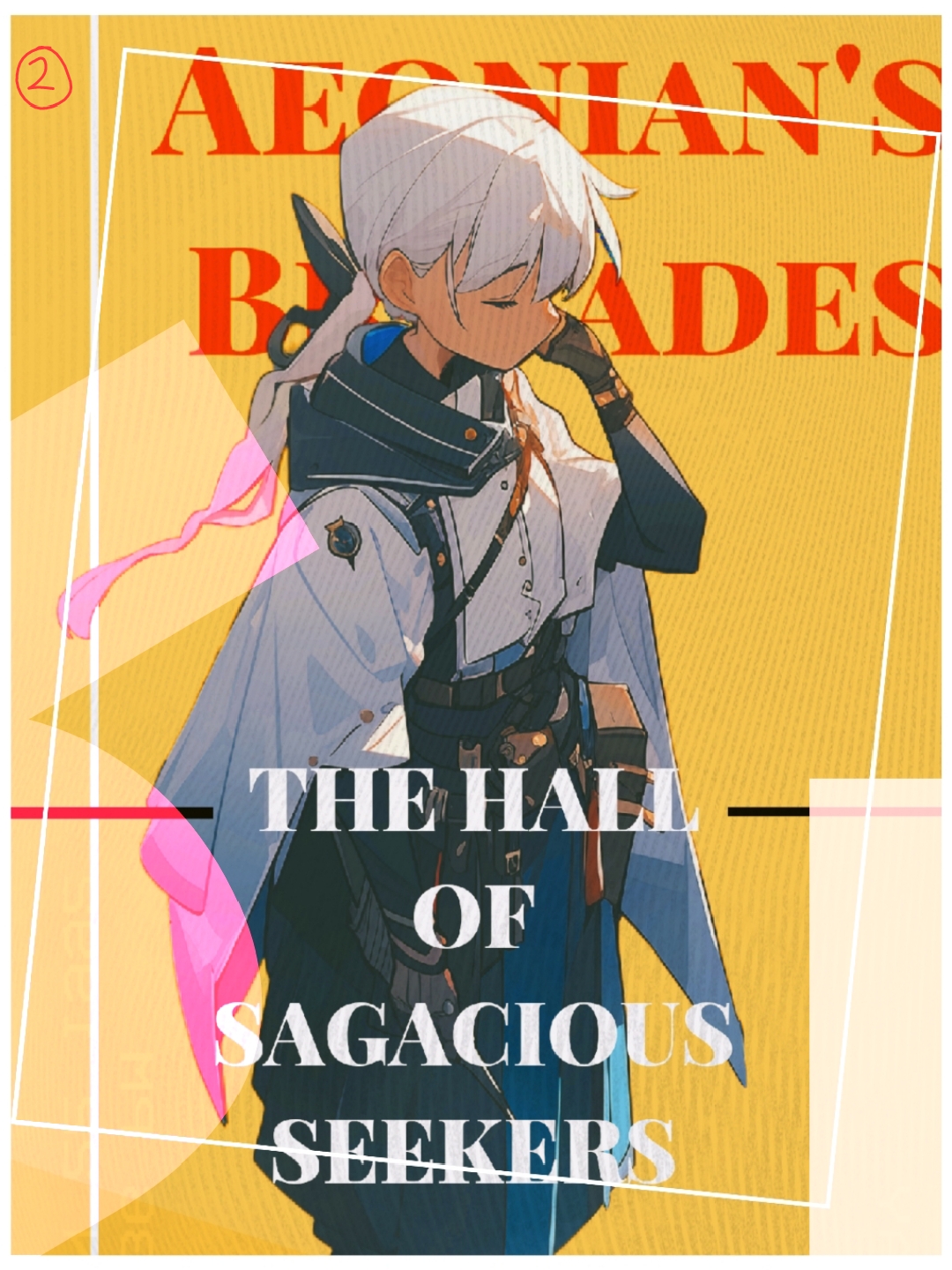
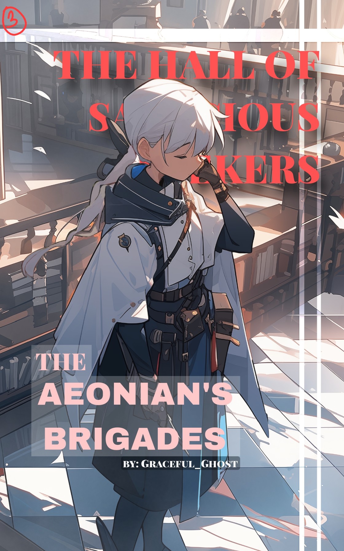
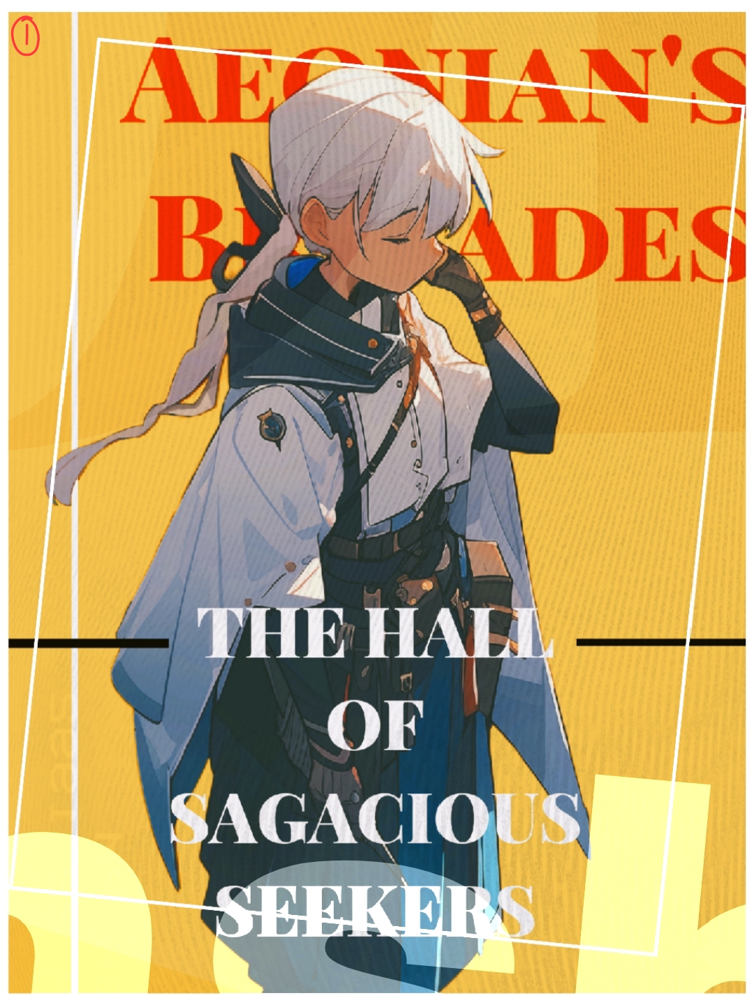
I need extra pair of eyes!

Which ones did you like?

  • 1

    Votes: 14 35.0%
  • 2

    Votes: 5 12.5%
  • 3

    Votes: 21 52.5%

  • Total voters
    40

Graceful_Ghost

Active member
Joined
Jan 9, 2023
Messages
39
Points
33
Which among the three is better? If you have any suggestions or criticism, feel free.
1710203349621.jpg
1710203381747.jpg
1710203421323.jpg
 

GlassRose

Kaleidoscope of Harmonious Contradiction
Joined
Apr 20, 2021
Messages
142
Points
83
I like one. The magenta on 2 contrasts too much, and doesn't serve a function. 3 is nice, but a bit generic and busy. Still, it does have a charm to it, and depending on the tone, or maybe, atmosphere/setting? of your story, might fit better, but without knowing that I prefer 1. It's unique and aesthetically pleasing.
 

Yule

Snowdrop
Joined
Feb 12, 2024
Messages
52
Points
33
I think it'd depend on the content too? 1 and 2 look more upbeat, sort of like a page I'd find on a magazine. I only voted 3 because it had the easiest title to read. (Unless...it wasn't the title...)
 

GabrielTenma

Active member
Joined
Mar 31, 2023
Messages
77
Points
33
I think it more depends on the story, I like number three the best because it gives off more of a fantasy-like vibe but then number one gives me more of a thriller sort of vibe whereas number two feels like a better number one but number one still works! (Take my opinions with a grain of salt, I can barely draw and don't know much about art, I'm just going off what I'd think at first look of the novel cover)
 

Cipiteca396

More Gasoline 🎶
Joined
Jun 6, 2021
Messages
2,181
Points
153
I can't read the text on 1 and 2 easily. I do like the little filter on 2 that partially changes the character's color. If that were a logo instead of a random effect, it could be interesting.

I vote 3, because I can see it clearly- but the text needs to be pushed around until it's all visible. (Or removed entirely. SH doesn't need the title written on the cover because the title will always be written next to the cover image anywhere you go on the site. It's redundant, unless it's meant to create an effect.)

If the images were actually thumbnail sized, maybe the first two would be better, since they're more eye catching. Hard to say.
 

Indicterra

Five little monkeys jumping on the bed 🎶
Joined
Oct 14, 2023
Messages
147
Points
43
For cover art number three, it's unique, eye-catching and very bright.

I am someone who purposefully put a white background in the cover art to give it highlights and an attention-grabbing feeling

The other two aren't suited to be cover art but more of illustration art, if it had details of some explanation I would taken it as one

Though u could do better


Is this your product, did you acquire them
 

NotaNuffian

This does spark joy.
Joined
Nov 26, 2019
Messages
3,683
Points
183
I feel like you physically assaulted my eyes with no. 2.

No. 3 like your standard isekai fantasy world thing.

No. 1 feels like you trying to be artsy.
 

prothy

Active member
Joined
Feb 16, 2019
Messages
1
Points
43
First one looks classic. Third one looks more modern/immersive. Really like both but personally I'd go for #3.
 

Indicterra

Five little monkeys jumping on the bed 🎶
Joined
Oct 14, 2023
Messages
147
Points
43
I used AI, I don't have a lot of time drawing these days. The app is called Niji • Journey on playstore/appstore(iirc)
That's explain the jumbled mess of title bar
I used AI, I don't have a lot of time drawing these days. The app is called Niji • Journey on playstore/appstore(iirc)
Can I ask a doubt about this app, I tried to do something with this but it keeps rejecting my demands related to the background

Do you have any advice
 
Last edited:

TheEldritchGod

A Cloud Of Pure Spite And Eyes
Joined
Dec 15, 2021
Messages
2,918
Points
153
I think you should have dozens of eyes. 3 eyes is so limited.
Or did you mean 3 PAIRS of eyes? Even then, only 6 eyes?
You have my pity, sir.
 

Graceful_Ghost

Active member
Joined
Jan 9, 2023
Messages
39
Points
33
That's explain the jumbled mess of title bar
We-well. I actually, I just edited title, together with inconsistent art from the AI. Its not perfect, but I thought it was enough to be hidden away during editing.

420d6e3b-b9ab-470b-9627-961bd2300472 (1).jpg


Can I ask a doubt about this app, I tried to do something with this but it keeps rejecting my demands related to the background

Do you have any advice
I had a lot of inconsistent results, even with just a simple prompt like "fill the background with only yellow." But it mostly never do that, if anything, it likes a lot of background.
I changed a lot of my prompts because of that, to get the results that I want. Even then, there's still a lot of redrawing. But what 'did' work for me was describing the background using popular titles.
So say, "a female, white haired and red eyes, standing at the modern red-colored roof, place from ancient titan's ocean: atlantis" and it works. Not perfectly though, but just enough for me to redraw.
 
Top