Cover images stretched if not in standard aspect ratio

Evie11

Active member
Joined
Sep 16, 2019
Messages
9
Points
43
Currently any cover image that isn't exactly the standard aspect ratio will get stretched or squished a bit. It's not super noticable on most images, but some that are really far off look really messed up.

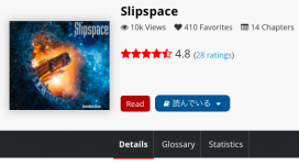
Example screenshots from Slipspace (the most distorted I've seen):
Current:
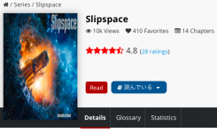
before.png

Fixed:
fixed.png

I've written some custom CSS to correct it, feel free to use this if you'd like:
CSS:
.fic_image {
	height: 259px;
	width: 180px;
	display: table-cell;
	vertical-align: middle;
	text-align: center;
}
.fic_image img {
	max-height: 259px;
	height: auto;
	width: auto;
}

Did some additional testing and noticed tall covers could be too tall with this old CSS, I've edited to a fixed version above.
CSS:
.fic_image {
    height: 230px;
    display: table-cell;
    vertical-align: middle;
}

.fic_image img {
    height: auto;
}
 
Last edited:

APieceOfRock

Yuri Lover, endeed!
Joined
Jun 21, 2022
Messages
573
Points
108
It would mess with the design of the main page I think. If everyone can make the ratio whatever they want then you will see less novels on the main page at a time. Well, other websites like Webnovel and Royalroad gives you the option the crop the image automatically to the perfect aspect ratio. I don't see why SH can't implement it instead of squishing the images.
 

AliceShiki

Magical Girl of Love and Justice
Joined
Dec 23, 2018
Messages
3,530
Points
183
There is a reason a specific ratio is requested.

This isn't a bug, but a feature.

If you want to suggest an alternative solution (like cropping, such as what APieceOfRock suggested) that would force all images to stick to the standard ratio, then you can make a thread on the Feature Requests subforum.
 

Evie11

Active member
Joined
Sep 16, 2019
Messages
9
Points
43
Didn't think of the home page tbh, I don't use it much. I did a bit of messing around and I think this looks good for the home page:
CSS:
.novel_carousel_img a:first-of-type {
    height: 142px;
    width: 100px;
    display: block;
}

.novel_carousel_img a:first-of-type img {
    height: 100%;
    width: 100%;
    object-fit: cover;
}
Before:
スクリーンショット 0004-11-06 20.57.03.png

After:
スクリーンショット 0004-11-06 20.57.10.png


I personally think this would make a good solution, uniformity on the home page but a bit of customizability on the novel page. And cropping to the right aspect ratio would always be an option if authors didn't like how their covers autocropped.

Might also be better to this same auto crop, but do it on the server side when generating this size of image for the home page, then they'd be a bit higher quality and you wouldn't be wasting bandwidth on cropped out parts of the image.


EDIT​


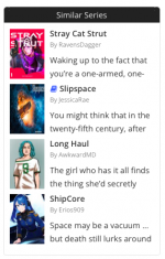
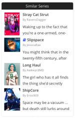
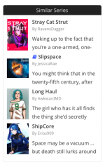
Noticed one more place it's not handled correctly, the Similar Series area:
CSS:
div.ficsimilar img {
    object-fit: contain;
}
CSS:
.ficsimilar {
    height: 86px;
    width: 70px;
    display: table-cell;
    vertical-align: middle;
    text-align: center;
}

.ficsimilar img {
    max-height: 86px;
    height: auto;
    width: auto;
}
This one I wasn't actually able to get to center properly, which imo is what would look best here, as the .ficsimilar div is a float div. Changing the .pull-left div to a separate div with the .ficsimilar div inside with this CSS would center it. For the current behaviour you can remove the display: table cell; vertical-align: middle; and it'll be unchanged.

Before | Old CSS | New CSS
スクリーンショット 0004-11-06 21.11.04.png スクリーンショット 0004-11-06 21.11.12.png スクリーンショット 0004-11-06 21.17.23.png


The only other place I can think of is the Reading List, which already handles aspect ratios correctly.
 
Last edited:

K5Rakitan

Level 34 👪 💍 Pronouns: she/whore ♀
Joined
Apr 15, 2020
Messages
8,366
Points
233
. . . interesting . . .
I think a distorted cover says something about the author, so I think leaving things the way they are is the way to go.
 

Evie11

Active member
Joined
Sep 16, 2019
Messages
9
Points
43
Kinda says more about the site than the authors to me, especially given the recommended size of 250×350 is not actually correct. It's a bit too short so even if you follow the site's advice your cover gets a bit stretched.

The site also already handles alternate aspect ratios correctly like a third of the time, there's just a couple key places it doesn't.
 

Zirrboy

Fueled by anger
Joined
Jan 25, 2021
Messages
1,152
Points
153
CSS:
.ficsimilar {
height: 86px;
width: 70px;
display: table-cell;
vertical-align: middle;
text-align: center;
}

.ficsimilar img {
max-height: 86px;
height: auto;
width: auto;
}

object-fit: contain; on the image seems to create your desired effect without any further changes. (in this case, it doesn't work with borders)

Not too big a fan of resizes on anything but the series page, though.
 

Evie11

Active member
Joined
Sep 16, 2019
Messages
9
Points
43
object-fit: contain; on the image seems to create your desired effect without any further changes. (in this case, it doesn't work with borders)

Not too big a fan of resizes on anything but the series page, though.
Ah true didn't think of that since I'd tried that on the series page and it was broken with the shadow but here it doesn't have that so yeah, that works fine.
 

Reimia

Member
Joined
Oct 25, 2022
Messages
1
Points
16
Kinda says more about the site than the authors to me, especially given the recommended size of 250×350 is not actually correct. It's a bit too short so even if you follow the site's advice your cover gets a bit stretched.

The site also already handles alternate aspect ratios correctly like a third of the time, there's just a couple key places it doesn't.
Yeah I don't know what it supposedly says about me, but I tried a couple different resolutions including the recommended one, only for it to still be blurry ( the recommended was the worst looking one).
 
Top