Alseki.
Laurant Writing Romans.
- Joined
- May 19, 2023
- Messages
- 152
- Points
- 63
It does have some symbolic significance to it.The one without a child crayon in it.
I'd say, I'd prefer the left one.Don't question.
I don't know how to put them in spoilers like others.
Oof technology can be difficult.
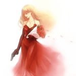
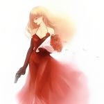
Anyway, first impression which one?
The crayon design's kinda off though, even if it has symbolic significance to the story. It gives a random passerby the idea that your work straddles in the realm of 'not-so-serious' or 'satire' stories. I suggest, if it's not what you mean, maybe you can try to 'morph' the crayon designs to 'real' versions to subtly tell the readers that they have to watch out for those 'crayon' designs.It does have some symbolic significance to it.
Though I was unsure whether it would grasp the attention of usual passerby or not.
The crayon style was chosen specifically. It's like Madoka Magica, to briefly sum up my reasoning.I'd say, I'd prefer the left one.
Though, you have a larger file for this? It's kinda blurry. You can make it smaller thru the Signature, anyway, or...just like me, my images are hidden in the 'Spoiler' button in my signature.
The crayon design's kinda off though, even if it has symbolic significance to the story. It gives a random passerby the idea that your work straddles in the realm of 'not-so-serious' or 'satire' stories. I suggest, if it's not what you mean, maybe you can try to 'morph' the crayon designs to 'real' versions to subtly tell the readers that they have to watch out for those 'crayon' designs.
They both are satanic.The nonsatanic one
Make the crayon art more muted so it doesnt take the focus away from the character.The crayon style was chosen specifically. It's like Madoka Magica, to briefly sum up my reasoning.
You are an art God, oh holy one impart further wisdom upon me. How should I improve this, suggest to me.
Good suggestion. Taken into consideration.Make the crayon art more muted so it doesnt take the focus away from the character.
No ples, I'm just a peasant who happens to know how to doodle.You are an art God, oh holy one impart further wisdom upon me.
I suggest you upload a large file, then resize it in the Signature for a better 'look'.How should I improve this, suggest to me.
That is humble of you. Though your stuff most certainly isn't just doodle.No ples, I'm just a peasant who happens to know how to doodle.
I suggest you upload a large file, then resize it in the Signature for a better 'look'.
If you can give me a larger version of the file, I can help you make a banner for your work. Also, give me your specs, so I can 'customize' it to your taste.
Thanks!That is humble of you. Though your stuff most certainly isn't just doodle.
Well, your image is small, judging from the looks, which is blurry. Prolly the size of the file is around 1mb and below. What I mean is, an image is better when it is large, then you make it smaller. If it is small then you made it bigger, the tendency is it will pixelate, or it'll be blurry. So going back to my recommendation, if you can upload a bigger file for that then make it smaller, I'm sure it'll look better.I am not sure if I follow, what do you mean by larger file size? Due you want me to realize it to fit my signature or something? Forgive this Amish for misunderstanding.
Ayt. I can help you with that, if you have the 'large' file for your image?I want a stark contrast between the bright nursery colours and dark unsettling tone of the story, to subvert expectations so to speak. Therefore, I wish to create a cover which will subtly hint ‘dark' while keeping the lady in red at focus.
Thanks a lot, these are the original highest quality files I have. Is it possible to improve their quality?Thanks!
Well, your image is small, judging from the looks, which is blurry. Prolly the size of the file is around 1mb and below. What I mean is, an image is better when it is large, then you make it smaller. If it is small then you made it bigger, the tendency is it will pixelate, or it'll be blurry. So going back to my recommendation, if you can upload a bigger file for that then make it smaller, I'm sure it'll look better.
Ayt. I can help you with that, if you have the 'large' file for your image?
Hmm...I think not. The biggest among them is 12.7 kb...which means it's not actually that big.Thanks a lot, these are the original highest quality files I have. Is it possible to improve their quality?
I just made them clearer:Hmm...I think not. The biggest among them is 12.7 kb...which means it's not actually that big.
However, since it's banner, I guess we can do a workaround? You have your 'crayon' designs?
And what is the title of your work?
You sure you don't want it put alongside the title and effects? It might be difficult if you add them later, though.I can add my crayons over the image later.
I actually don't have one... At least in English.If you got a tagline for your story, it's even better.
Alright, I will very quickly make the crayon high quality one. Any suggestion on where should I put what?If you got a tagline for your story, it's even better.
You sure you don't want it put alongside the title and effects? It might be difficult if you add them later, though.
This is the crayon design?There is supposed to be a headless silhouette of a man with a white shirt (not sure how to incorporate it with white background), a (perhaps few) stars in blue giving of yellow light, and a red road leading to a Stardust castle (I couldn't draw a castle).
Yes XD.This is the crayon design?
Wait up, I'll try it on my PC. I'll show it to you after.Yes XD.
I bet a three-year-old kid can be a better conveyer and executor of art than me.