Suitable Fontstyle

Generik0

Joined
Mar 28, 2020
Messages
272
Points
133
I felt unsatisfied with my current font for my upcoming story.
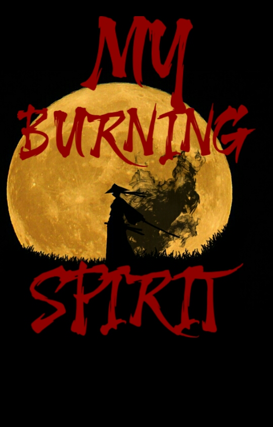
PicsArt_05-10-08.14.52.jpg


Either way, I'm not an expert in graphic design (since this cover took little to no effort) but I wanted to hear recommended font styles that might be better than my choice.
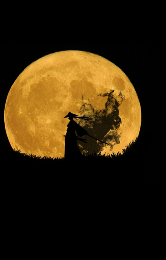
PicsArt_05-10-08.01.40.jpg


Thanks!

Also this a story set in Edo Japan.
 
D

Deleted member 49654

Guest
You can try something with a caligraphy feel to it. I think it will fit well with the shadowy samurai on the cover.
 

Ruyi

༺ aureate sect ༻
Joined
Jan 22, 2019
Messages
104
Points
83
i like your font, but i do think it's way, waaay too big in your original design for the cover, hmm. what if you concentrated it all on the bottom of the picture and put your author name on top to balance it out, for example?
 

BubbleC

Floating Idiot
Joined
Jan 29, 2021
Messages
125
Points
63
The font's good, but I think you should center the moon and figure in the background more. Right now it's a little too far to the left in my opinion.
Also, I'm no expert on typography, but you might want to play around with the font size and the placement of the words on the page so it looks more visually appealing.
 

BubbleC

Floating Idiot
Joined
Jan 29, 2021
Messages
125
Points
63
It's centered well, but I think the author's name is a bit awkwardly placed. There's no need to tilt it so far and to place it so far into the left corner. Just putting it above the moon to balance out the composition of the cover would be fine.

You can think of objects you place on the page as weights; too many condensed on one side without a counteracting force often makes an image appear imbalanced or awkward. This doesn't mean your images have to be perfectly symmetrical, but adding some small text such as your name to balance out the title out the bottom may be good.

You may want to increase the brightness of the text since the moon's brightness somewhat drowns out the text and doesn't make it stand out much.

(Again, I'm not good with typography at all, so I can't provide much advice for the word placement besides that. Take what I say with a grain of salt).
 
Last edited:

High-in-the-skys

Awkward member
Joined
Jan 2, 2021
Messages
327
Points
108
Modified this as a practice
I don't think what I did was complete but appreciate if you could rate it...
Untitled32_20210512114055.png
 
Last edited:
Top