radraccoon
Well-known member
- Joined
- Feb 5, 2022
- Messages
- 38
- Points
- 58
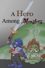
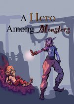
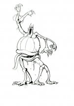
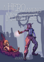
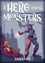
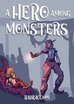
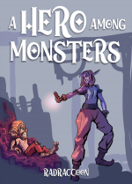
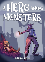
I've been told that my current cover, with the battle plans text and building on it, is too bland to draw in readers. However I felt it was a good indicator of the humor and tone of the story. I was advised to emphasize waifus, but there's only two women in the book and neither is presented as waifu material. I feel like the image with the goblin raising the sword up in triumph also fits the tone of the story (and is, in fact, the opening scene--even if it's just a story main character is telling). The other image is the two main goblins in the story, Tad and Glum, but if sex appeal is how to bring in readers then this would be the opposite.
So what makes for a good cover? Any advice?


So what makes for a good cover? Any advice?