owotrucked
Isekai express delivery
- Joined
- Feb 18, 2021
- Messages
- 1,086
- Points
- 153
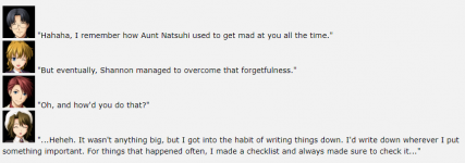
I would like to evaluate the impact of characters icons as a replacement for dialogue tags.
Samples
Evaluation of your reading experience
Please tell me what you thought abouts those samples. To guide your answer, here are my main concerns:
Impact on reading ease
I want to calibrate the rate of information so that a reader who has spent a long day at work and is running on his last two brain cells can read without too much effort. That's why all dialogue lines must be explicitely tied to a character, without the reader needing to check the context.
Impact on focus
My aim with dialogue tags is to let the reader focus on the content of dialogue, and avoid distracting descriptions that would lose a tired reader. However, portrait icons could just distract the reader from the content.
Experience so far
I have introduced character icons in the middle of my story (an interlude in chapter 26, and from chapter 41), and no reader has complained so far.
However, after updating my prologue, I had a feedback of a new reader that the portrait icons worsen the reading experience. I do know someone else who feel that portrait icons are distracting.
Speculation and suggestions
I wonder if the gradual introduction of character icons help the readers to get familiarized with the VN-like style and help them not paying too much attention to them. Or maybe my long time readers are too deep in to be bothered by the icons to complain.
In order to improve the reading experience, I can see a few possibilities:
- Gradual introduction of the character icons (slowly increase their usage throughout the chapters)
- Downsize the icons, so that readers only see the general shape of the face without seeing details
- Decrease the frequency of the icons, like limiting to 5 per 1000 words
I am open to other suggestions to improve reader experience.
Thank you for your inputs,
(☞゚ヮ゚)☞trucked
Samples
Lorely could only bite her lips in frustration, longing for the beautiful mistress with whom she used to share passionate nights.
 “How about I take Mistress outside to wash a bit?”
Violet made up an excuse and walked away from Lorely’s discomforting gaze.
“Whatever, I am too busy on inspection today.”
The harpy silently followed her mistress to make sure she performed her duties.
Violet, the sovereign of the newly made dungeon, was currently checking the status of the various tasks she had ordered.
“I’m eager to see how much progress we made on the tunnel!”
“What the... We’re so behind the deadline! It’s hopeless! Why would you enjoy seeing it?”
“It’s okay, it’s the Shadow lord’s fault for sending us without enough resources.”
“You fool! The sole reason I was created was to serve the Shadow lord! Don’t say such rude things.”
“I apologize, Mistress.”
Their mission was to dig a tunnel connecting an isolated crystal mine to the western dungeon citadel Rustvalley, so that they could lay waste on the despicable worshippers of the Light.
Picking the short end of the straw, she was sent to take charge of the mine’s side with a pack of troglodyte Pawns and three heroic Rooks.
“Mistress, the warren isn’t that way...”

Violet made up an excuse and walked away from Lorely’s discomforting gaze.

The harpy silently followed her mistress to make sure she performed her duties.
Violet, the sovereign of the newly made dungeon, was currently checking the status of the various tasks she had ordered.
Their mission was to dig a tunnel connecting an isolated crystal mine to the western dungeon citadel Rustvalley, so that they could lay waste on the despicable worshippers of the Light.

Picking the short end of the straw, she was sent to take charge of the mine’s side with a pack of troglodyte Pawns and three heroic Rooks.
Lorely could only bite her lips in frustration, longing for the beautiful mistress with whom she used to share passionate nights.
“How about I take Mistress outside to wash a bit?” she asked.
Violet made up an excuse and walked away from Lorely’s discomforting gaze. “Whatever, I am too busy on inspection today.”
The harpy silently followed her mistress to make sure she performed her duties.
Violet, the sovereign of the newly made dungeon, was currently checking the status of the various tasks she had ordered.
Lorely: “I’m eager to see how much progress we made on the tunnel!”
Violet: “What the... We’re so behind the deadline! It’s hopeless! Why would you enjoy seeing it?”
Lorely: “It’s okay, it’s the Shadow lord’s fault for sending us without enough resources.”
Violet: “You fool! The sole reason I was created was to serve the Shadow lord! Don’t say such rude things.”
Lorely: “I apologize, Mistress.”
Their mission was to dig a tunnel connecting an isolated crystal mine to the western dungeon citadel Rustvalley, so that they could lay waste on the despicable worshippers of the Light.
Picking the short end of the straw, she was sent to take charge of the mine’s side with a pack of troglodyte Pawns and three heroic Rooks.
Lorely: “Mistress, the warren isn’t that way...”
Evaluation of your reading experience
Please tell me what you thought abouts those samples. To guide your answer, here are my main concerns:
Impact on reading ease
I want to calibrate the rate of information so that a reader who has spent a long day at work and is running on his last two brain cells can read without too much effort. That's why all dialogue lines must be explicitely tied to a character, without the reader needing to check the context.
Impact on focus
My aim with dialogue tags is to let the reader focus on the content of dialogue, and avoid distracting descriptions that would lose a tired reader. However, portrait icons could just distract the reader from the content.
Experience so far
I have introduced character icons in the middle of my story (an interlude in chapter 26, and from chapter 41), and no reader has complained so far.
However, after updating my prologue, I had a feedback of a new reader that the portrait icons worsen the reading experience. I do know someone else who feel that portrait icons are distracting.
Speculation and suggestions
I wonder if the gradual introduction of character icons help the readers to get familiarized with the VN-like style and help them not paying too much attention to them. Or maybe my long time readers are too deep in to be bothered by the icons to complain.
In order to improve the reading experience, I can see a few possibilities:
- Gradual introduction of the character icons (slowly increase their usage throughout the chapters)
- Downsize the icons, so that readers only see the general shape of the face without seeing details
- Decrease the frequency of the icons, like limiting to 5 per 1000 words
I am open to other suggestions to improve reader experience.
Thank you for your inputs,
(☞゚ヮ゚)☞trucked