Cover Design

Astreda

New member
Joined
Mar 15, 2024
Messages
5
Points
3
Hello guys, I'm new here.
And I can design for novel cover

Here's an example :
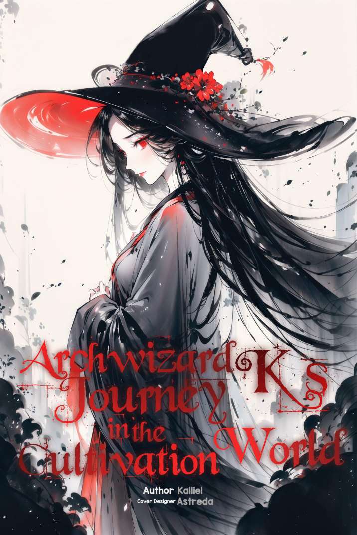
Shotcom_IMG_20240316_134500.jpg

https://pixeldrain.com/u/tUGT9Rij (the link is just for backup)
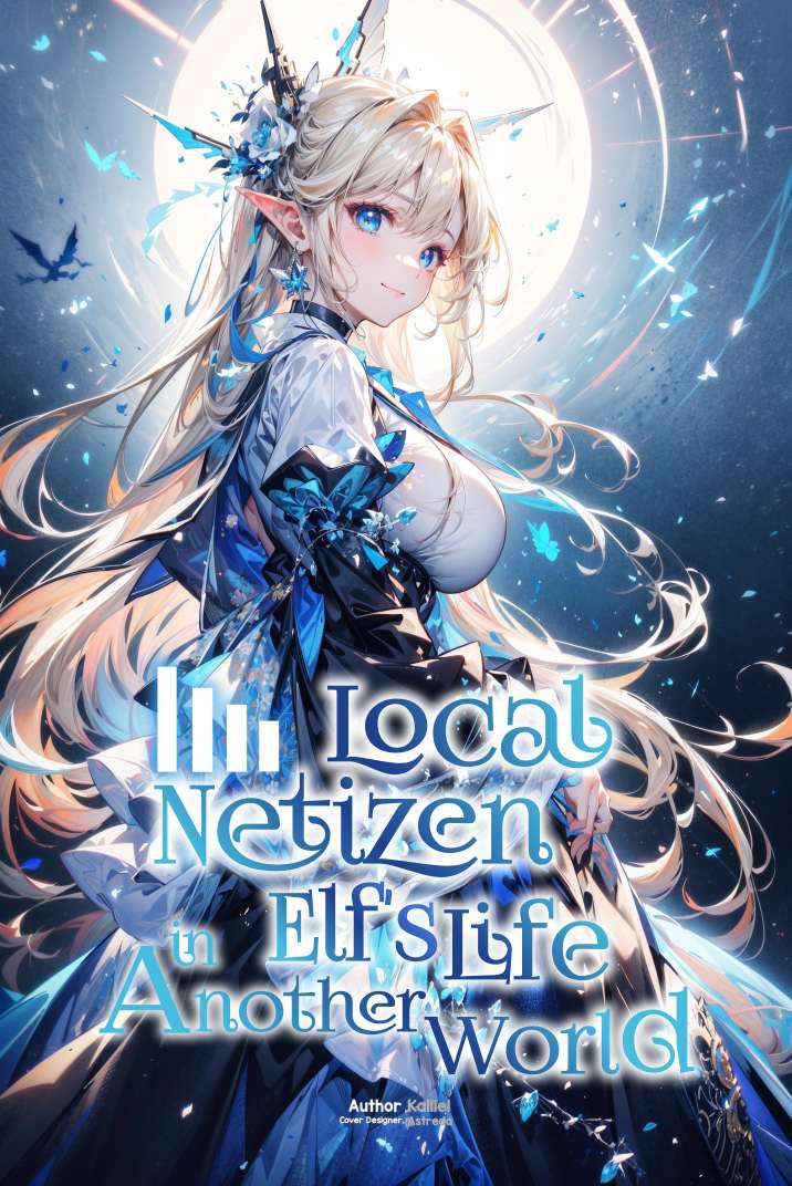
Shotcom_IMG_20240316_135822.jpg

https://pixeldrain.com/u/fTHg7666

so, i want to know what's your opinion and what do you think about the cover and if i open commission to design text cover.

And btw Kalliel want the clean version of cover(without footnote) so im uploading the footnote version here, to know if it good or bad.

Also its free copyright btw(the text design). And the design is inspired from English Manwha Cover.
 

PancakesWitch

Well-known member
Joined
Sep 12, 2020
Messages
244
Points
103
they look nice but the text can't be read on a small thumb nail size, sometimes it sbetter to write somethign simple
 

Attachments

  • Epic of121212.jpg
    Epic of121212.jpg
    529.8 KB · Views: 12
  • Epic of (1).jpg
    Epic of (1).jpg
    536.3 KB · Views: 13

tiaf

ゞ(シㅇ3ㅇ)っ•♥•Speak fishy, read BL.•♥•
Joined
May 29, 2019
Messages
2,291
Points
153
my very short introducton into traditional calligraphy taught me that the first/capatilized letters should always the the largest/longest letter

this is not the case here and it kinda bugs me

otherwise it is nice
 

Astreda

New member
Joined
Mar 15, 2024
Messages
5
Points
3
I think they look nice.

My only concern would be the high detail and lack of contrast. It might not look so good shrunken down to a thumb nail.
Thanks and Yeah, i still trying and it's my first time editing a novel cover, that's why the second i try to add more white shadow in the text.
they look nice but the text can't be read on a small thumb nail size, sometimes it sbetter to write somethign simple
Thanks, and yours is good and easy to read because the clear contrast.

For me your text font doesn't feel right with the beautiful fantasy characters and environment in the background. So for me, probably i will find a stylist font and add glicht effect on it.
my very short introducton into traditional calligraphy taught me that the first/capatilized letters should always the the largest/longest letter

this is not the case here and it kinda bugs me

otherwise it is nice
Oh yeah that's one, yes i feel like that's better. But I'm editing it on my low-end mobile phone with Photo Editor app.

So it's feel like a lot of work than to do it in PC/ Laptop using CorelDraw. And i design it for free anyway

Thanks
 
Last edited:
Top