Made a book cover for my story . Would appreciate any feedback

Maze_Runner

□■ - I like running in mazes - ■□
Joined
Nov 16, 2021
Messages
320
Points
78
Hi! I made a poster for my novel in the artstyle of Persona . Well my friend did most of it anyways i only helped with the sketch since i am no good with art . The point of the cover was to showcase the mc's two sides .One where he is bound to his past trauma and the other where he is trying to break free . The novel's name is Breaking the Masquerade so i thought it was kinda fitting .I'd appreciate any feedback . link to the book to better understand https://www.scribblehub.com/series/482143/breaking-the-masquerade/View attachment 13736
Wow . . . That's so good!
 

Bartun

Friendly Saurian Neighbor
Joined
Dec 9, 2020
Messages
664
Points
133
Hi! I made a poster for my novel in the artstyle of Persona . Well my friend did most of it anyways i only helped with the sketch since i am no good with art . The point of the cover was to showcase the mc's two sides .One where he is bound to his past trauma and the other where he is trying to break free . The novel's name is Breaking the Masquerade so i thought it was kinda fitting .I'd appreciate any feedback . link to the book to better understand https://www.scribblehub.com/series/482143/breaking-the-masquerade/View attachment 13736
This is actually pretty good! Great job!
 

patbateman123x

Active member
Joined
Apr 25, 2022
Messages
75
Points
33
This is actually pretty good! Great job!
ty ! someone pointed out a lot of things i can fix in this so i might improve on this given how bleak the cover looks.Maybe add some color and some light hearted stuff to the art like the mc smiling or something since the novel only foreshadows the tragic stuff so far .I don't want people to think i am on a killing spree hahaha
 

Ilikewaterkusa

You have to take out their families...
Joined
May 21, 2021
Messages
2,373
Points
153
Hi! I made a poster for my novel in the artstyle of Persona . Well my friend did most of it anyways i only helped with the sketch since i am no good with art . The point of the cover was to showcase the mc's two sides .One where he is bound to his past trauma and the other where he is trying to break free . The novel's name is Breaking the Masquerade so i thought it was kinda fitting .I'd appreciate any feedback . link to the book to better understand https://www.scribblehub.com/series/482143/breaking-the-masquerade/View attachment 13736
Looks like light yagami
 

patbateman123x

Active member
Joined
Apr 25, 2022
Messages
75
Points
33
Looks like light yagami
I only gave my friend a rough sketch you know one of those really bad ones .... but he turned it into something out of a shoujo manga ...Personally i don't like light at all but we are not here to debate over him . Maybe the colors and lighting make him look like him but i just asked him to draw me a pretty boy . That's all i said . Then he blessed me with this and i am glad i took the plunge . Those art students really are something
 

Attachments

  • bw2mc.jpg
    bw2mc.jpg
    52.5 KB · Views: 26

Ilikewaterkusa

You have to take out their families...
Joined
May 21, 2021
Messages
2,373
Points
153
I only gave my friend a rough sketch you know one of those really bad ones .... but he turned it into something out of a shoujo manga ...Personally i don't like light at all but we are not here to debate over him . Maybe the colors and lighting make him look like him but i just asked him to draw me a pretty boy . That's all i said . Then he blessed me with this and i am glad i took the plunge . Those art students really are something
Hopefully we won’t see anyone rejected out of art school
 

CypherTails

Well-known member
Joined
Jan 9, 2021
Messages
76
Points
58
I only gave my friend a rough sketch you know one of those really bad ones .... but he turned it into something out of a shoujo manga ...Personally i don't like light at all but we are not here to debate over him . Maybe the colors and lighting make him look like him but i just asked him to draw me a pretty boy . That's all i said . Then he blessed me with this and i am glad i took the plunge . Those art students really are something
I like this actually because he looks detached and wistful. So if you frame that with pretty and bright colors it would create this sense of unease that matches the duality of your story.

EDIT: Ideally we should see more of him, you won't have room much for words with such a close-up shot without clipping into his facial features.
 

patbateman123x

Active member
Joined
Apr 25, 2022
Messages
75
Points
33
I like this actually because he looks detached and wistful. So if you frame that with pretty and bright colors it would create this sense of unease that matches the duality of your story.

EDIT: Ideally we should see more of him, you won't have room much for words with such a close-up shot without clipping into his facial features.
Thank you for the feedback . You know that could actually work .I actually have a few more sketches of the mc i might have to analyse them to come up with a good idea to potray the duality. Yours was a godsend . It gave me some inspiration for symbolism. There are light hearted ones where he is having tea with his maid and ones where he is smiling into nothingness .So i could put the wistful and that back to back where he is putting on a front on the surface while on the inside that's how he actually feel ( that's how i feel too lol) mirroring it basically . I have to finish writing a new chapter today but after that I'll have a sit down with him and discuss it your idea . Thank you again!
Hopefully we won’t see anyone rejected out of art school
cant speak for everyone but my friend , even if he does , he lives in my basement so at least he wont be homeless haha .There is always a silver lining .Man i cant wait to rub it in his face
So book cover got approved and my god it got butchered
 
Last edited:

Average

Active member
Joined
Apr 3, 2022
Messages
18
Points
43
I dont know how helpful it is, but if you right-click on the image and open In new tab it will show the resolution if you hover over the tab.
 

patbateman123x

Active member
Joined
Apr 25, 2022
Messages
75
Points
33
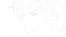
Perhaps in that case you could reflect the light heartedness and the darker undertones in the cover. Because right now the cover just looks bleak so when you read the light heartedness right at the start there might be some dissonance. The initial impact of the story matters too so by making the first impression to be light hearted but yet something feels a little off in the cover might lead to setting the mood you want without letting the sudden dark turn seem out of nowhere. You should allude to these things before they happen, dramatic changes need a bit of set up.

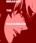
I actually have an example of something like this, because I was drafting a story similar in tone to yours. Basically beautiful exterior but dark interior.

View attachment 13740

So the idea for this cover was to seem off at first glance. The Psychedelics title text that almost hurts the eyes and the crimson blood contrasting with the cheerful greens, yellows and blues. Even the title reflects it subconsciously, which is that Dreams can be good and bad but friends are usually good. So the blood is under the dreams. Most people won't pick it up but by alluding to things, the mind can pick up things subconsciously. It won't work for all your readers but it will work for some.

PS. I may check out your book later, but I don't have the time now.
Hey buddy! I tried to make another cover this time opting for a more minimalist approach . Tried to copy your style i am sorry
 

Attachments

  • 2.jpg
    2.jpg
    34.2 KB · Views: 28

CypherTails

Well-known member
Joined
Jan 9, 2021
Messages
76
Points
58
Personally I would say avoid clipping the text into facial features. So for that you would probably need to zoom out a little more. Also I wouldn't recommend scattering the text out like that it would be better to make some space and just put them together.

I also have a random idea just gonna throw it out to you. Why not do a front profile of the MC and do something like this.

1651483610300.png


Just make the mask side happy and his exposed side angry/sad. It's also easier to draw since the face doesn't need to be symmetrical. You can even distort the features to make it seem off putting. Since the name is the masquerade, why not use a mask on the cover?

You can still go for the minimalist style but my main issue with the current cover is that I can't get much information from the cover. I suppose you could say it's not blatant enough?
 

patbateman123x

Active member
Joined
Apr 25, 2022
Messages
75
Points
33
Personally I would say avoid clipping the text into facial features. So for that you would probably need to zoom out a little more. Also I wouldn't recommend scattering the text out like that it would be better to make some space and just put them together.

I also have a random idea just gonna throw it out to you. Why not do a front profile of the MC and do something like this.

View attachment 13763

Just make the mask side happy and his exposed side angry/sad. It's also easier to draw since the face doesn't need to be symmetrical. You can even distort the features to make it seem off putting. Since the name is the masquerade, why not use a mask on the cover?

You can still go for the minimalist style but my main issue with the current cover is that I can't get much information from the cover. I suppose you could say it's not blatant enough?
thats a sick idea ! Thanks bro .I thought the text looked off too . And the zooming out idea didn't cross my mind .I am an idiot
 
Last edited:
Top