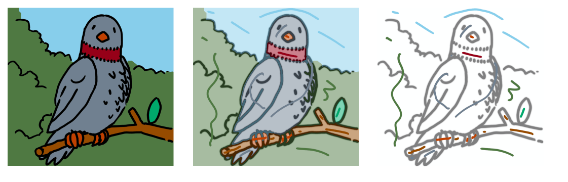
In my technique, I use layers to separate my colors, just in case I need them in future corrections. My lineart is done traditionally, using technical pens for inking, and a scanner for paper to digital transfers.
If you look at my bottom right corner, you'll see how I do my layers. Since this is a cover that I worked on, the layers are divided into 'Text', 'Image' and 'Background'. In most of my illustrations, the only ones that are important are the 'Image' and 'Background'.
In my Image Folder, I organized my layers into 'Effects', 'Highlights', 'Shadows' and 'Colors'. I think the first three are self-explanatory, but the last one, 'Colors' is where I put my image's base colors.
The Color Folder is further organized into three (usual): Accessory, Clothing, and Body. Accessory is where the parts of the image that can't be categorized in Clothing, such as ribbons, swords, guns, books, etc. Clothing is organized into the clothing articles that appear on the illustration, such as pants, skirts, socks, shoes, blouses, hats, etc. Finally, Body is where the colors of skin, eyes, hair, lips and others appearing.
In my Shadows Folder, this is where I put the darker colors of the base ones. The only layer that is important in there is the Grey Shadows layer, where I put the Grey Shadows for blending with other darker colors.
For Highlights, only one or two Highlight Folders (depending on the color I wanted to have highlights), and a White Highlight layer, usually reserved for White shimmers found throughout my work.
If you notice, there's the Outline Layer above the Highlight, Shadows, Color layers. This is where I put my scanned lineart, locked so that I won't accidentally make changes to it.
And then we have the Effects Layer. This is where the 'magic' of the illustration comes from. Here I put the effects that I wanted to appear in my work.
My background has layers depending on the needs of the illustration. But most likely, only the White Background Layer won't be removed.
Some other important notes when using layers:
Blending Options--this is one of your bestfriends, aside from the masks. Some of the important ones that I use are:
1) Multiply -- it would make the color or image pass through the layer. If a 'Multiply' layer is at the top, the colors under it would appear. Pretty useful when you're applying shadows in your work.
2) Screen -- a light color, when applied to a 'Screen' layer, would make it 'lighten up'. Used in applying highlights.
3) Soft Light -- I generally use this to apply the 'ambient' color for the work.
In any case, much have been said by the previous replies about the layers. I hope this reply would help you on blending those layers and create a better artwork!